Iteration
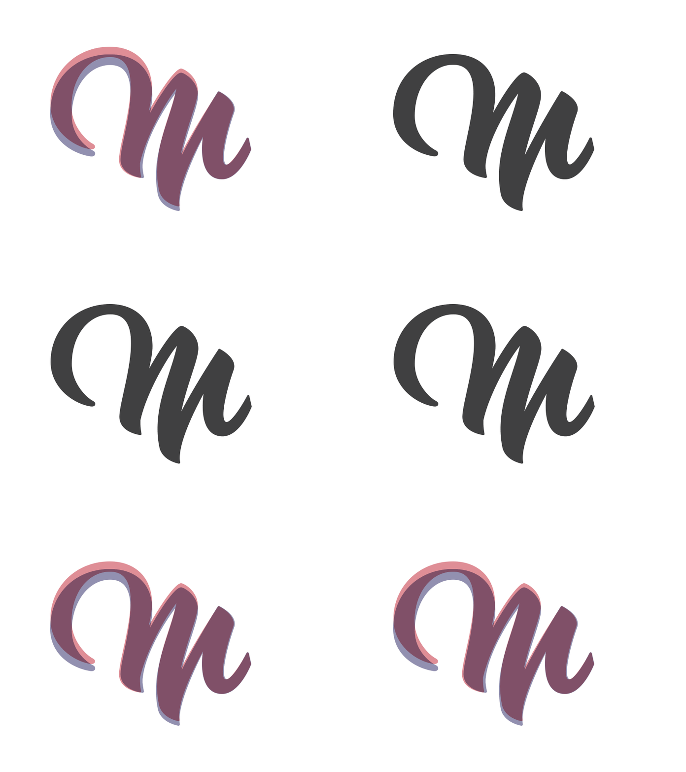
I put together a little animation to show the changes I made to the "M" from two posts ago. They're not drastic, but when put next to each other you can tell it's definitely an upgrade.
Here's a short run down of what I fixed: both the inside and outside curve on the swash, narrowed the stems to match the rest of the letters, and bumped up the left side of the letter to make it look more like a capital. Might do a full case study on this one once I get my website up.
More by scott smoker View profile
Like

