🍺 Le Blaireau Qui Brasse – Vienne Blonde Beer 🌾
📌 Project Description:
🔹 Introduction
Le Blaireau Qui Brasse is a handcrafted, premium blonde beer inspired by the natural beauty of Vienne and the art of traditional brewing. This design reflects the bold character of the brand, the richness of its flavors, and its deep roots in the craft beer community. The packaging concept combines vintage aesthetics, rustic charm, and a modern twist to stand out on shelves and resonate with beer enthusiasts.
Perfect for craft breweries, specialty beer branding, and rustic yet premium beverage packaging.
🔹 Concept & Art Direction
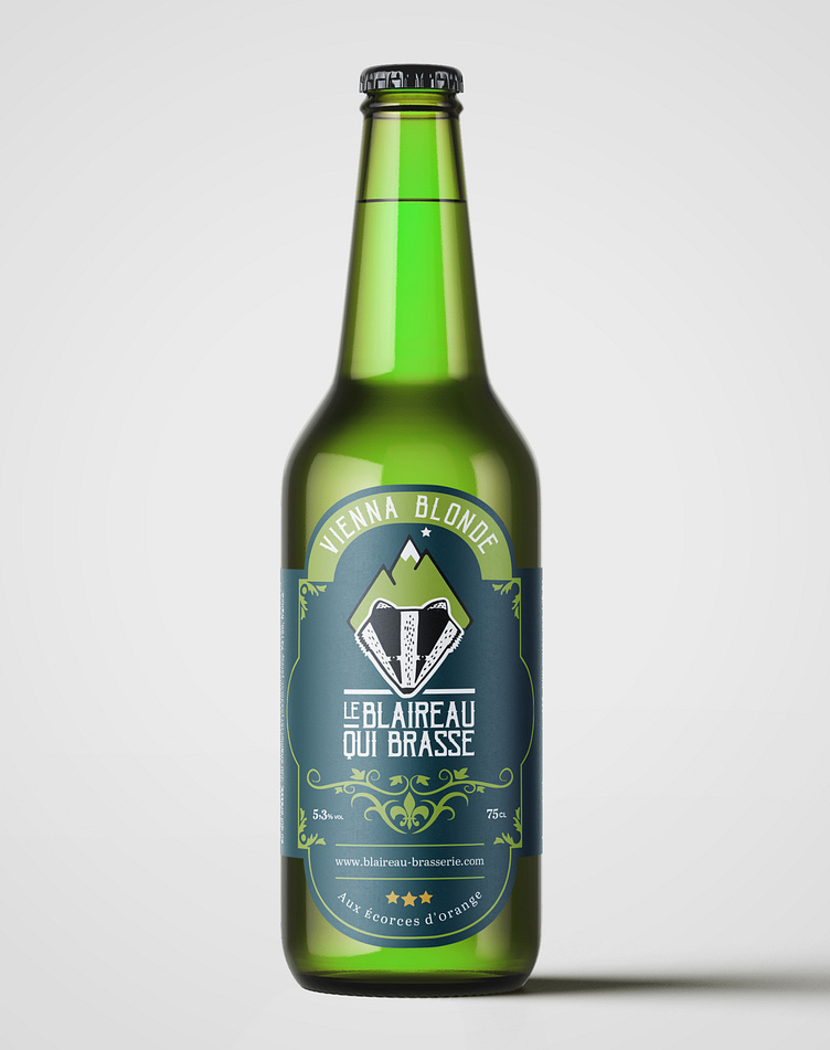
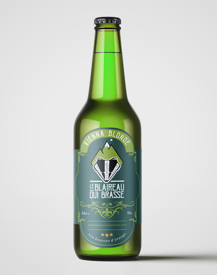
✅ Structural Features & Bottle Design:
Amber glass bottle to protect flavor and enhance premium appeal.
Embossed logo on the bottle cap for authenticity.
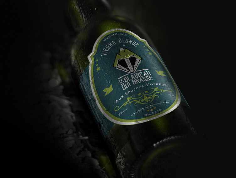
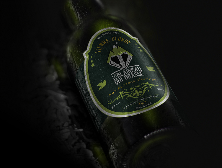
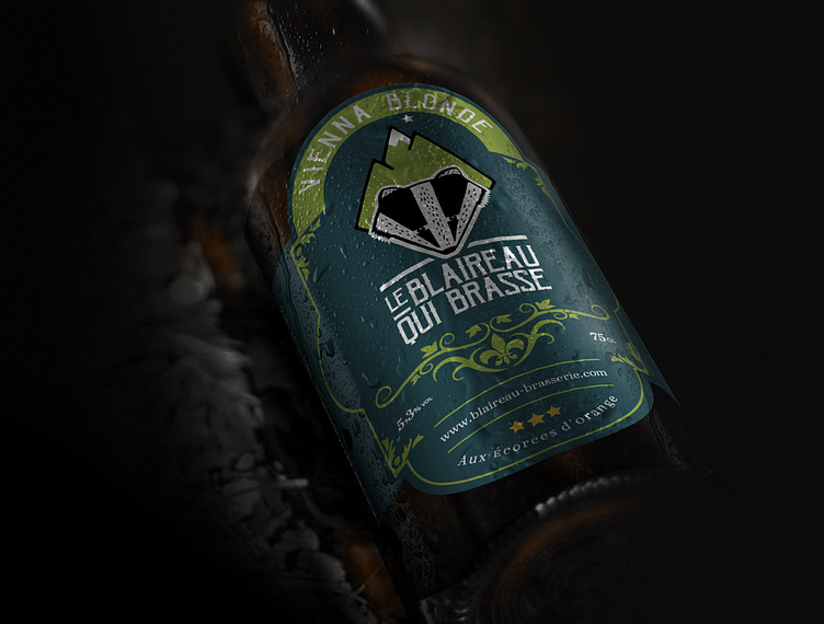
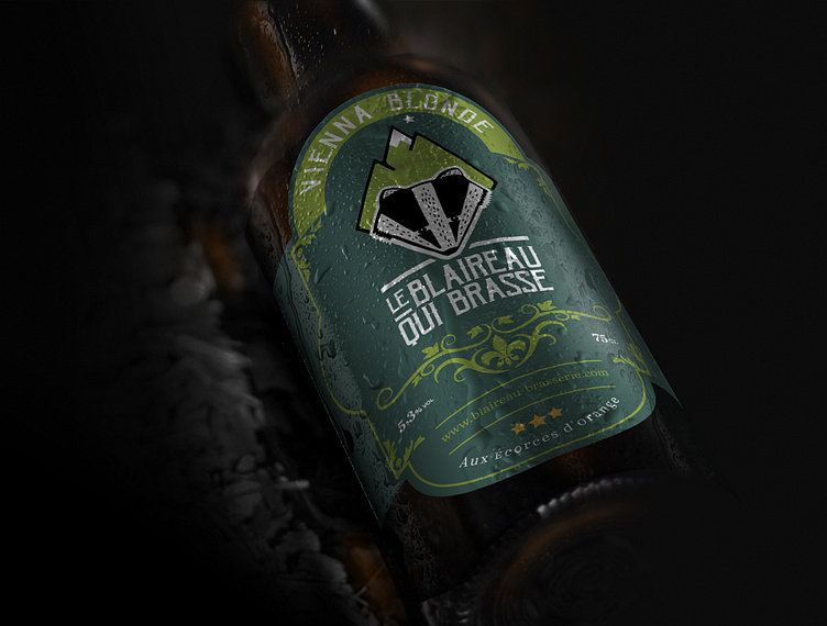
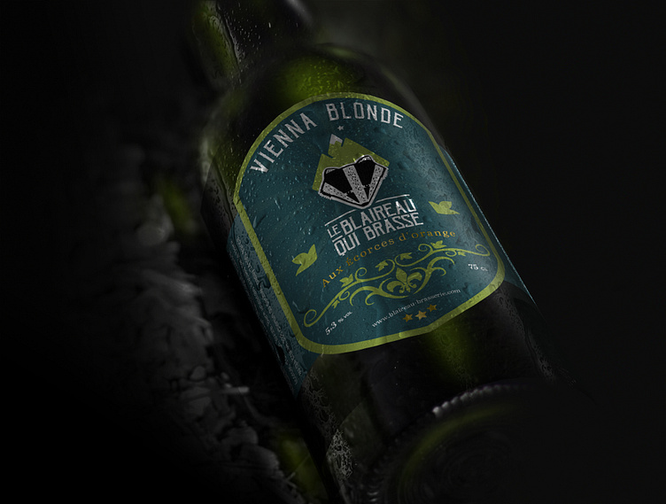
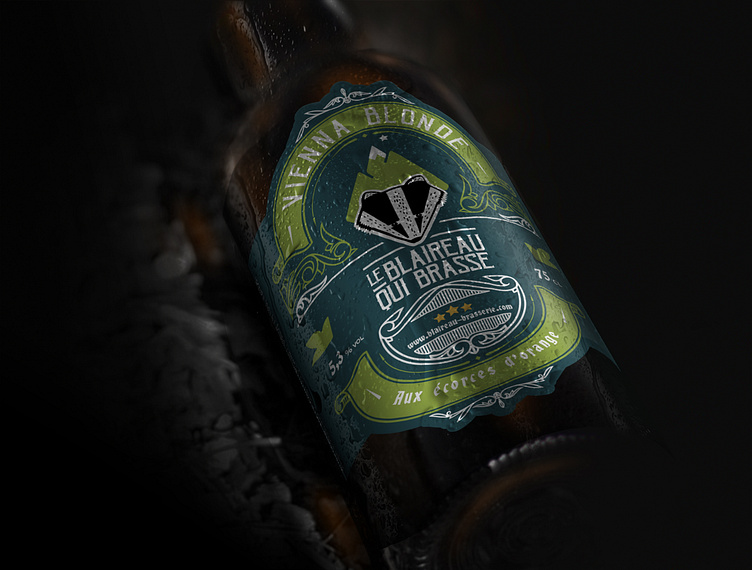
Label with hand-drawn illustrations and vintage typography.
✅ Color Palette & Mood:
Earthy tones, deep golds, and warm amber hues to reflect the richness of the beer.
A mix of matte and glossy textures for a rustic yet refined feel.
✅ Typography & Branding:
Vintage-inspired serif fonts with handcrafted script accents.
Bold, clean lettering to emphasize authenticity and quality.
✅ Visual Elements & Graphics:
Illustration of a badger (blaireau) as the central branding icon.
Subtle hop patterns and barley textures integrated into the design.
Minimalist, nature-inspired label layout for a sophisticated touch.
✅ Material & Finishing Touches:
Eco-friendly, textured paper labels for a handcrafted feel.
Gold foil or embossed elements for a premium effect.
Hand-drawn details that enhance the artisanal aesthetic.
This design is a perfect fusion of heritage, craftsmanship, and modern branding, making it an instant classic for craft beer lovers.
🔹 Design Process
🖌 Moodboard & Inspirations: Classic craft beer labels, European brewing heritage, vintage typography. 📐 Sketches & Structural Development: Exploring label layouts, bottle form, and usability. 🎨 Color & Material Selection: Deep golden and earthy tones for a warm, premium look. 📦 Typography & Branding: A mix of traditional and contemporary elements for a unique identity. 💡 Mockups & 3D Renderings: Showcasing the bottle’s presence in bars, retail shelves, and craft breweries.
🔹 Final Packaging Presentation
📸 Key Visuals:
✅ Flat-lay dieline and 3D bottle mockups.
✅ Close-ups of label details, textures, and typography choices.
✅ Lifestyle shots featuring the beer served in rustic settings.
✅ Retail display and branding visuals showcasing its market presence.
🔹 Conclusion & Call-to-Action
💬 "A bold and artisanal craft beer packaging design that embodies tradition, craftsmanship, and rich brewing heritage."
👉 What do you think of this rustic yet premium beer bottle design? Drop your thoughts in the comments!
📢 Looking for a standout craft beer label design?Let’s bring your brand to life with timeless and eye-catching packaging! 🚀🍺
