Magazine Mayhem
Overview
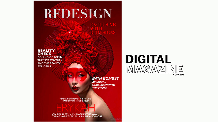
There’s something so comforting about flipping through a magazine—whether it’s the glossy pages in my hands or the digital version on my phone. One evening, as I was indulging in one of my favorite pastimes, I found myself scrolling through a magazine’s mobile site, completely immersed—until something pulled me out of the experience.
The layout felt all too familiar. A hamburger menu on the left, the company name perfectly centered and a subscribe button neatly placed on the right. I brushed it off at first, but curiosity got the best of me. A little digging later, and I realized… this wasn’t just a coincidence, it was everywhere. Magazine after magazine, the same predictable formula. It made me wonder—was this truly the best way to design a mobile reading experience? Or had we just accepted it as the way? And if so, what possibilities were we overlooking?

Solution
A bold UX redesign that ditches tradition in favor of innovation, accessibility and modern user behavior.
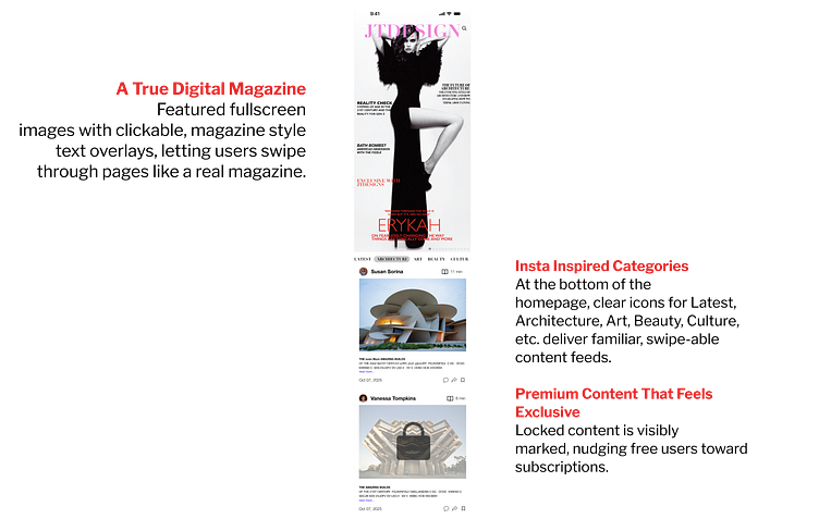
• Tiered Access Model: free articles for guest, with premium users getting access to unlimited
articles and exclusive content.
• Smart Content Loops: auto-loading articles keep users engaged 35% longer. (Nielsen Norman
Group, 2023)
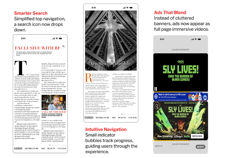
• Reimagining Navigation: Visible search and intuitive browsing increase engagement by 40%.
(Google UX Research, 2023)
• Strategic Ad Monetization: Native ads boost engagement by 57% without disrupting the
reading experience. (Harvard Digital Advertising Study, 2023)
• Adaptive Color UI: Text and UI elements adjust dynamically for optimal readability. (Apple &
Google Dynamic UI Studies, 2024)

Impact
• Lower bounce rates = higher engagement and ad revenue. (Google Ad Revenue Report, 2023)
• Less friction = stronger reader retention. (Harvard UX Study, 2023)
• Soft paywalls = higher conversions. (Laredo Morning Times saw a 1,213% increase in digital
subscribers using this model, 2023)
