Logo v.3
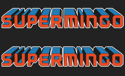
slightly modified version of my new logo,
added shading which i feel has improved it,
thinned out the white border/stroke.
I would just like some help deciding between the two here,
the only difference is the kerning between the 'R' and 'M' on the bottom version = I wasn't too keen on the gap in the top version as I'm trying to make it look like one whole word, on one sticker. (top one seems kinda separated to me)
thoughts please :D
More by Matt Alderson View profile
Like

