Search
Hello everyone! 👋
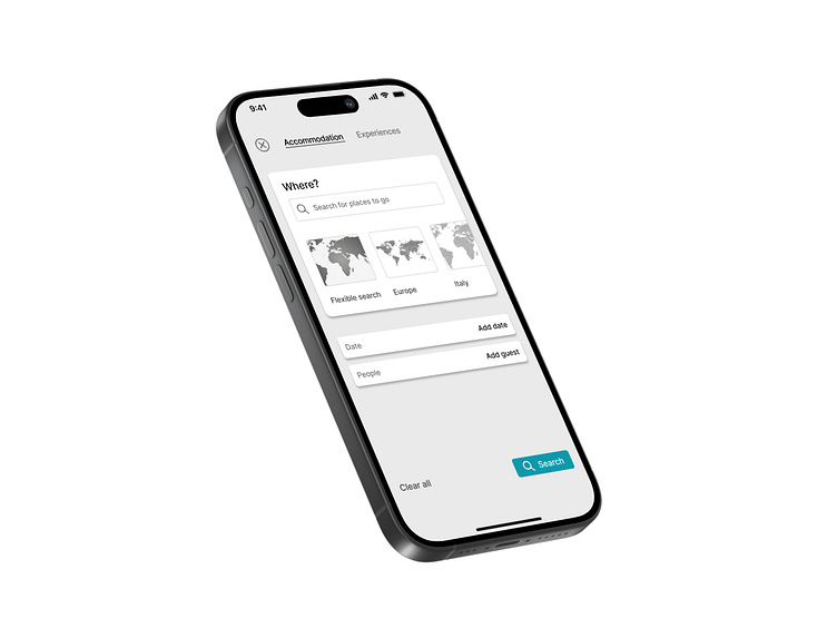
I have completed my twenty-second study. Search- Daily UI Challenge #022
Design Analysis
This travel booking search interface is designed to provide a seamless and efficient way for users to explore accommodation and experiences. The layout prioritizes clarity, ease of use, and structured input fields, making the search process intuitive.
1. Minimalist & Clean Layout
• The simple, uncluttered design allows users to focus on their search criteria without distractions.
• The hierarchical structure ensures a natural flow from destination selection to date and guest details, optimizing user interaction.
2. Well-Defined Search Inputs
• The location search bar is prominently placed at the top, making it the primary focal point.
• The quick-select region buttons (Flexible search, Europe, Italy) enhance usability by offering preset suggestions.
• Date and guest input fields are clearly labeled and accessible, ensuring users can input details effortlessly.
3. Strong Visual Cues for Action
• The Search button, with its distinct color contrast, stands out against the neutral background, guiding users toward the next step.
• The “Clear all” option provides a quick way to reset inputs, enhancing usability
4. Typography & Readability
• A modern, sans-serif font ensures legibility and a professional look.
• Proper spacing and font weight differentiation create a clear distinction between labels, inputs, and actions.
This travel search UI successfully balances functionality and aesthetics, offering a smooth and user-friendly experience. The structured form, intuitive interactions, and clean design make it an efficient tool for users to search and plan their next trip effortlessly.
