Clean & Minimal CMS Dashboard UI – Data-Driven Design
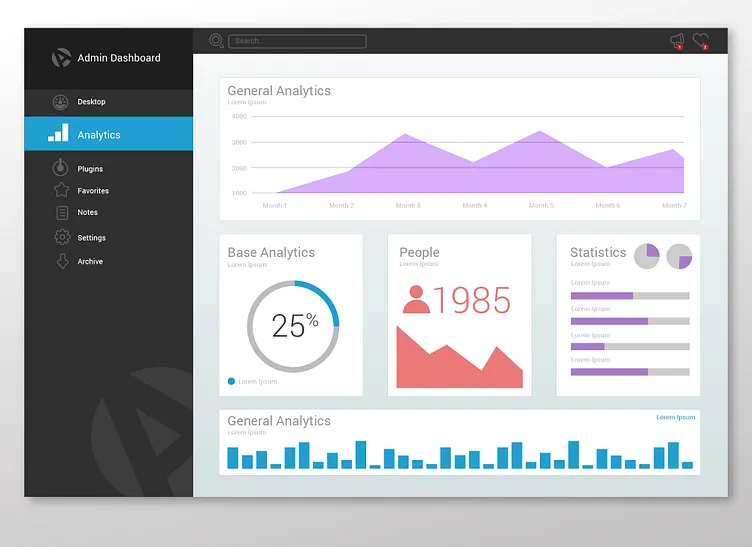
I designed this clean and minimal CMS dashboard UI with a focus on clarity, usability, and structured data visualization. My goal was to create an intuitive interface where users can quickly analyze key metrics without visual clutter.
💡 How I Created This: 1️⃣ Wireframing & Layout Planning: I started with a simple grid structure to ensure a well-balanced dashboard. 2️⃣ Color Scheme & UI Elements: Used a light theme with subtle contrast to keep the design modern and easy on the eyes. The blue, red, and purple accents help differentiate data sections. 3️⃣ Charts & Data Visualization: Incorporated line graphs, pie charts, progress bars, and numeric indicators to present analytics clearly. 4️⃣ Sidebar Navigation: Created a left-aligned menu for easy navigation, featuring icons for better accessibility. 5️⃣ Final Refinements: Adjusted spacing, typography, and icon placements to achieve a professional, sleek look.
This CMS dashboard UI is ideal for business analytics, data management, and admin panels. What do you think? Let me know in the comments! 🚀
