Leaderboard
Hello everyone! 👋
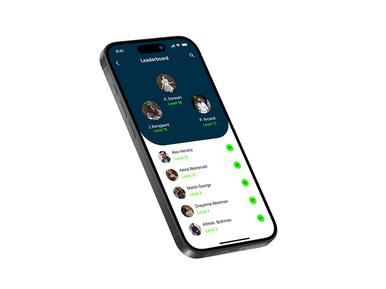
I have completed my nineteenth study. Leaderboard- Daily UI Challenge #019
Design Analysis
This leaderboard design provides a clear and engaging way to display rankings while maintaining a visually appealing structure. The layout is well-balanced, ensuring both readability and hierarchy, allowing users to quickly identify top performers.
1. Well-Structured Layout
• The top-ranked players are highlighted in a distinct section with larger profile images, ensuring immediate recognition of leaders.
• The remaining rankings follow a clear, numbered list format, making it easy to scan.
2. Effective Use of Color & Contrast
• The dark background in the top section creates a strong contrast with the white lower section, making the leaderboard visually dynamic.
• The green typography for levels and ranking numbers enhances visibility without overpowering the design.
3. Strong Information Hierarchy
• Profile images, names, and levels are presented in a consistent structure, ensuring easy readability. • Numbers for rankings are placed prominently on the right, allowing for quick reference.
4. Typography & Readability
• The modern sans-serif font maintains a clean aesthetic.
• Font weight variations (bold for names, regular for levels) create a natural reading flow.
• Proper spacing between elements ensures a clutter-free experience.
This leaderboard screen successfully balances aesthetic appeal with functional clarity, making it easy for users to track rankings while keeping the interface engaging.
