Nomad HR and Recruitment - Visual Identity


Nomad HR & Recruitment needed a fresh brand identity that would differentiate them in the crowded recruitment market. They wanted to convey their unique approach of proactive talent acquisition and long-term fit matching, rather than simply filling vacant positions.
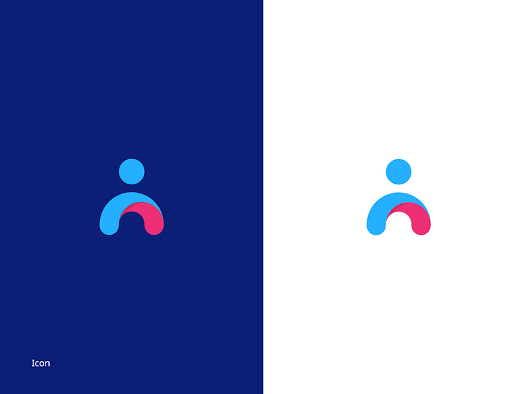
The icon features an abstract human figure created with smooth, flowing lines. The blue elements represent trust and innovation, while the pink arch symbolizes energy and the supportive connection Nomad creates between employers and candidates. The wordmark uses a clean, modern typeface that balances professionalism with accessibility.
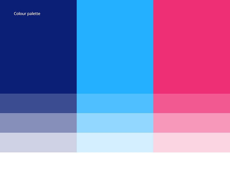
The three-color system uses deep navy blue as the primary color to convey stability and expertise, bright sky blue for innovation and openness, and vibrant pink for energy and passion. Each color includes tonal variations for flexibility across different applications.

The three-color system uses deep navy blue as the primary color to convey trust and stability, bright sky blue for innovation and openness, and vibrant pink for energy and the human connection at the heart of recruitment. Each color includes tonal variations for flexibility across different applications.
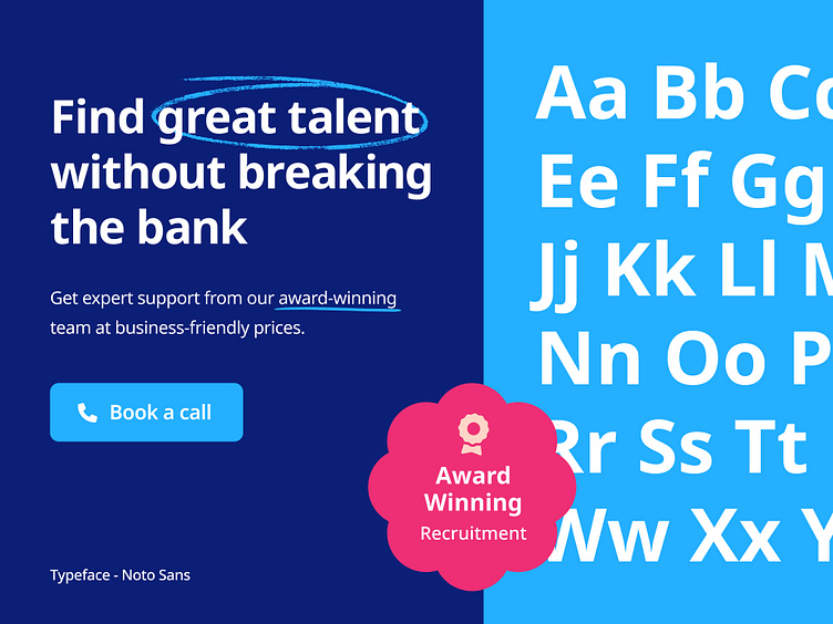
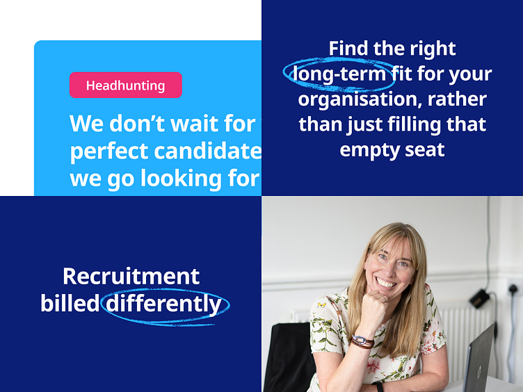
Noto Sans was selected as the primary typeface for its excellent readability and modern feel. Underline highlights in bright blue draw attention to key value propositions like "award-winning" and "great talent."

The final brand identity successfully positions Nomad HR & Recruitment as a modern, people-focused agency that delivers exceptional value. The vibrant yet professional design system stands out in the recruitment industry while conveying the approachable expertise that defines the Nomad experience.
Design that works
I'm Silviu Hogasi, a freelance designer specialising in visual identity, website design, and UI/UX. I transform business challenges into clear, purposeful design solutions that connect with audiences and drive growth. My work balances creative impact with functional elegance.
