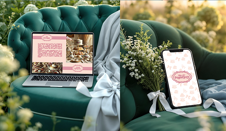
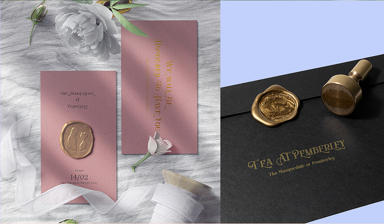
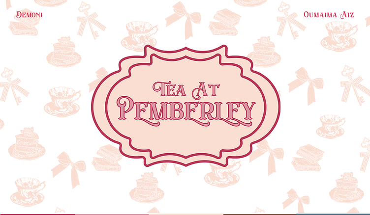
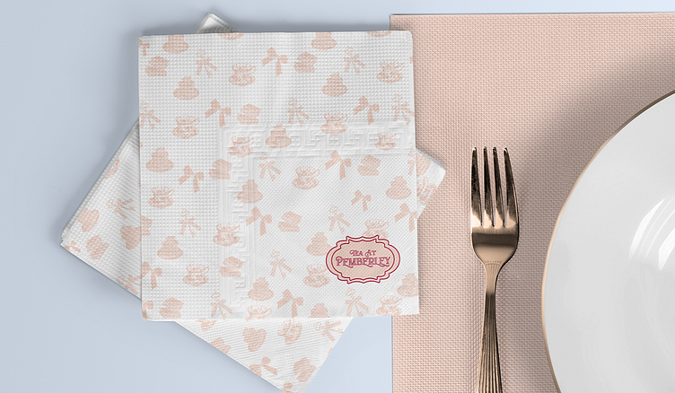
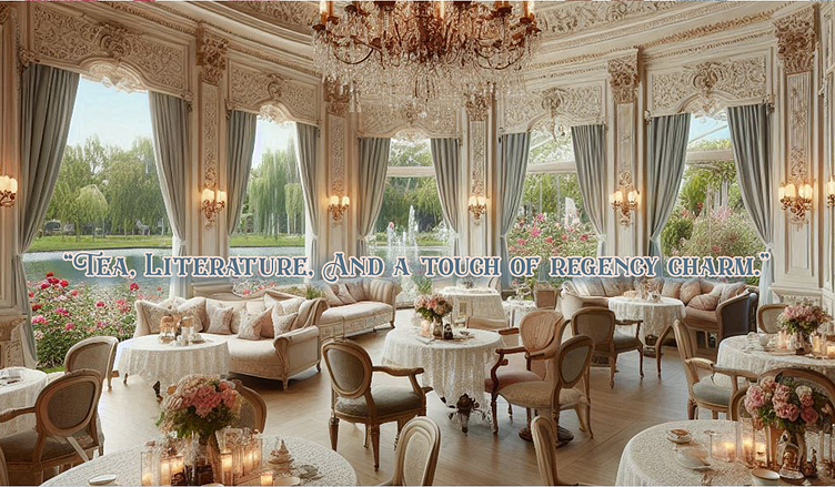
Tea At Pemberley branding project
"At Tea at Pemberley, we blend the art of traditional tea craftsmanship with the timeless grace of Jane Austen’s world. Our mission is to create a sanctuary of sophistication and warmth, where every sip transports guests to an era of refined leisure, meaningful connection, and poetic indulgence. From ethically sourced teas to meticulously curated rituals, we invite you to savor moments of quiet luxury, steeped in tradition and storytelling."

Color Palette Analysis
Maroon (#B83556): A deep, warm red that exudes luxury and sophistication. Perfect for creating a sense of richness and tradition.
Parrot Pink (#DC97A5): A soft, muted pink that adds a touch of femininity and warmth.
Lumber (#FADED2): A warm, creamy beige that feels cozy and inviting.
Milk Chocolate (#845747): A deep, earthy brown that grounds the palette. Adds a rustic, natural touch to the overall aesthetic.
UCLA Blue (#55768C): A muted, dusty blue that adds a calming and timeless quality.

"To become the destination where literature, history, and tea unite—a place where modern souls reconnect with the art of slowing down, one exquisite cup at a time."