DealSync – Brand Guidelines for CRM Platform
For DealSync, we created a brand identity that reflects clarity, efficiency, and seamless sales management. Our goal was to create a visual system that enhances trust while making the platform feel modern and approachable.
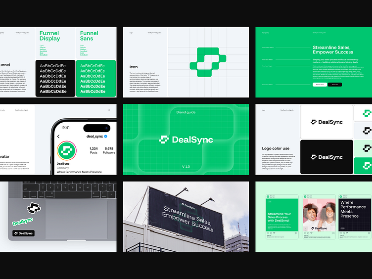
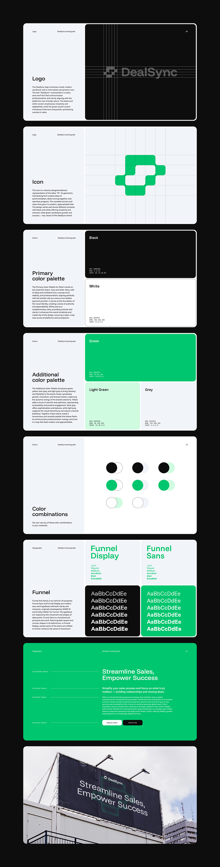
The logo design features an abstract “D” icon, symbolizing synchronization and deal flow, reinforcing the platform’s role as a streamlined CRM solution. The structured yet minimalistic approach ensures versatility across both digital and print applications. The green accent color embodies growth and success, essential values for sales teams, while the Funnel Display and Funnel Sans typography introduce a structured yet friendly tone, ensuring easy readability across all touchpoints.
To maintain a consistent and professional brand presence, we designed a grid-based layout and balanced color combinations, ensuring clarity and impact. The result is a branding system that not only elevates DealSync’s market position but also enhances the user experience, making the platform instantly recognizable and visually compelling.
outcrowd.io
We ensure your brand image won't get lost in the market noise.
With design and branding, Outcrowd helps reveal your brand's essence and build products that attract users, impress investors, and drive breakthrough growth.
Become a part of Outcrowd communities: