Cardinal Repair & Maintenance branding and website (case study)

Cardinal Repair & Maintenance. Building a Brand from the Ground Up
Cardinal Repair & Maintenance was a newly established company with no existing website or branding. As the lead and sole website designer, I was responsible for creating a digital presence that would establish their identity, showcase their services, and set them apart in the industry.
My Role:
Designed and developed the company’s first website, ensuring a clean, professional, and user-friendly experience.
Collaborated with the branding team to establish the company’s visual identity, selecting color schemes, typography, and design elements that reflect reliability and expertise.
Created a logo concept that, while not ultimately chosen, is still featured in this case study to highlight the design exploration process.
The Outcome:
The final website provided Cardinal Repair & Maintenance with a strong online presence, helping them connect with clients and establish credibility in their industry. By blending functionality with a modern aesthetic, the site serves as an effective foundation for their growing business.
Cardinal Repair & Maintenance.
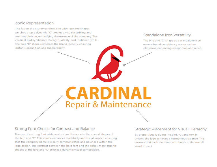
Logo Concept Breakdown
When designing the logo for Cardinal Repair & Maintenance, the client wanted to incorporate their mascot—a cardinal—within the letter “C.” My goal was to create a strong, recognizable mark that reflected the company’s reliability and professionalism while maintaining a bold and modern aesthetic.
My Approach:
Integrated Mascot: I designed a cardinal seamlessly positioned within the “C,” ensuring the bird remained a focal point without overpowering the letterform.
Balance of Strength & Simplicity: The concept emphasized clean lines and a structured composition, making it versatile for branding across various applications.
Brand Cohesion: The logo was developed to align with the company's color scheme and overall brand identity, ensuring consistency across the website and marketing materials.
While my design wasn’t selected as the final logo, I’ve chosen to showcase it in this case study to highlight the creative process and exploration behind establishing Cardinal Repair & Maintenance’s brand identity.
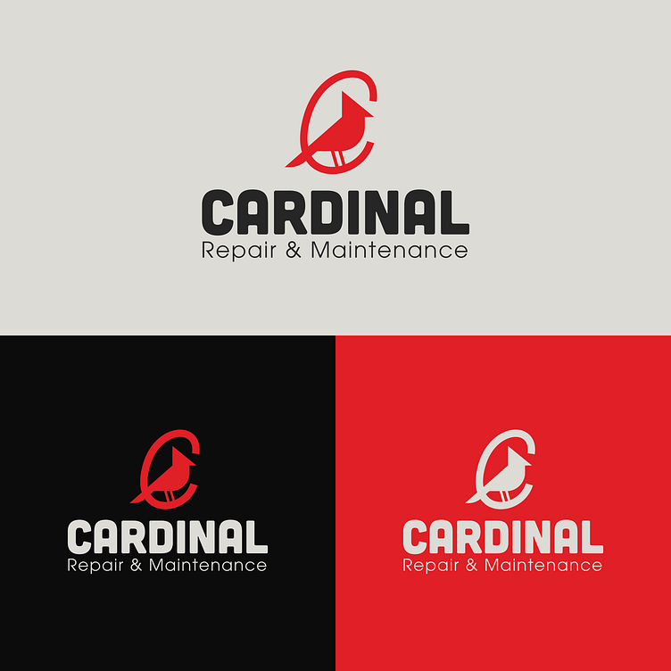
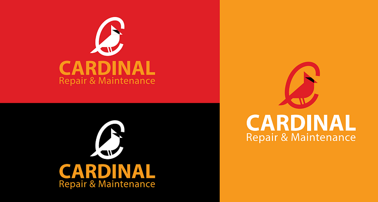

Alternative Scrap logo concepts

Website Design
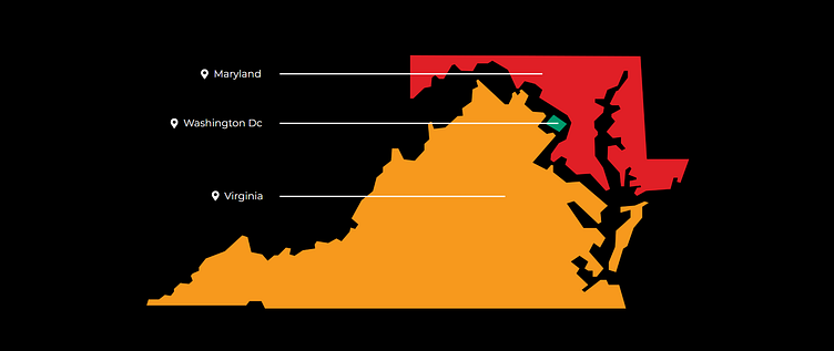
Custom Service Area Map
To visually represent the regions Cardinal Repair & Maintenance serves, I designed a custom interactive map highlighting Washington D.C., Maryland, and Virginia. This design incorporates the company’s brand colors to distinguish each state clearly. This approach not only enhances visual appeal but also provides a quick and intuitive way for customers to identify their service areas at a glance.
Disclaimer: This project was created during my time as a Graphic Designer at Metro Nova Creative in Fredericksburg, VA. All work showcased reflects my contributions to the project while employed there. While I both designed and developed this website using WordPress and Elementor, I am no longer responsible for maintaining or updating their current live versions. As a result, any changes made on the live websites after my involvement may not reflect my original design or development work.