Webflow Website with a Focus on UX and Design
🚀 Scope: Webflow development, branding, animations
🎨 Focus: Clear visual structure, intuitive navigation, strong presentation showcase
The Challenge
Hexagonal View specializes in creating structured, visually compelling presentations. They needed a website that:
✔️ Clearly explain the process—how design, structure, and storytelling work together.
✔️ Showcases past projects in an engaging and accessible format.
✔️ Looks modern and stands out from typical corporate websites.
The key challenge? Balancing striking visuals with ease of use.
What We Did
1️⃣ Homepage & Navigation
- Designed a clear, logical user journey so visitors instantly understand what Hexagonal View does.
- Organized pages in a way that prevents information overload while keeping users engaged.
- Implemented smooth transitions between sections, eliminating abrupt content changes that could distract users.
📊 Impact: Users can quickly find relevant information, reducing drop-off rates.
2️⃣ Visual Identity & Graphics
- Developed a cohesive visual language that complements Hexagonal View’s presentation style.
- Added subtle animations to enhance engagement without overwhelming the user.
- Used soft contrasts and neutral tones to maintain focus on content.
📊 Impact: Improved content readability and a more polished, professional aesthetic.
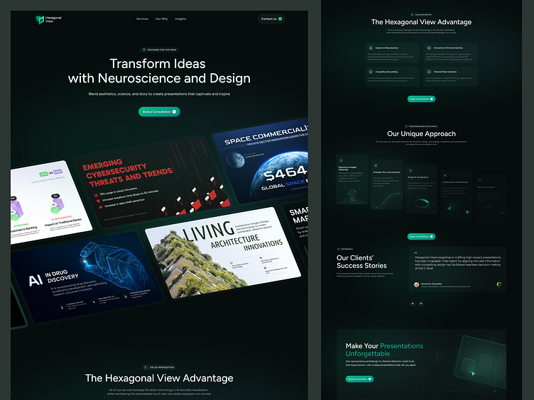
3️⃣ Presentation Showcase
- Placed project examples front and center, ensuring they take priority over other elements.
- Designed a seamless browsing experience, allowing users to quickly scroll through and assess Hexagonal View’s work.
- Added hover effects to make the showcase more interactive without cluttering the UI.
📊 Impact: More users engage with case studies rather than simply scrolling past.
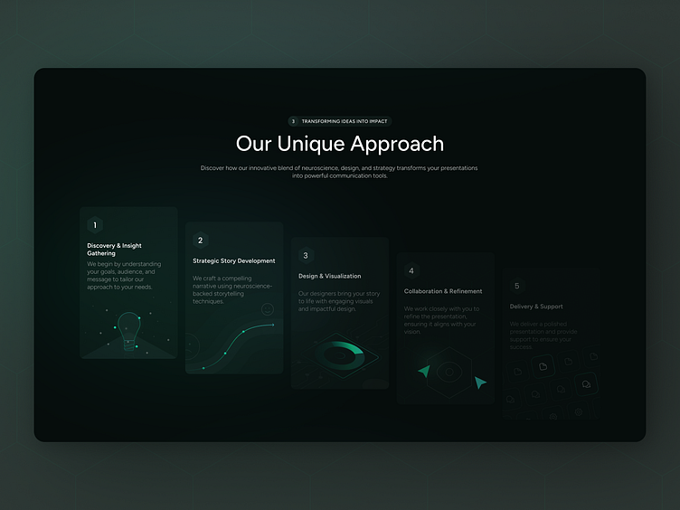
4️⃣ Step-by-Step Process Section
- Simplified the explanation of the Hexagonal View’s methodology, making it accessible to all users.
- Used icons and micro-animations to highlight each step visually.
📊 Impact: Visitors understand the company’s workflow faster, reducing friction in the decision-making process.
How the Website Improved User Experience
📊 Higher engagement—smooth animations and structure keep users interested.
📅 Better project visibility—portfolio is now easier to explore.
🔗 Clearer call to action—guiding users toward booking a consultation seamlessly.
📩 Need a well-structured, visually strong website? Let’s talk!
