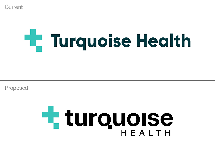
Healthcare logo rework
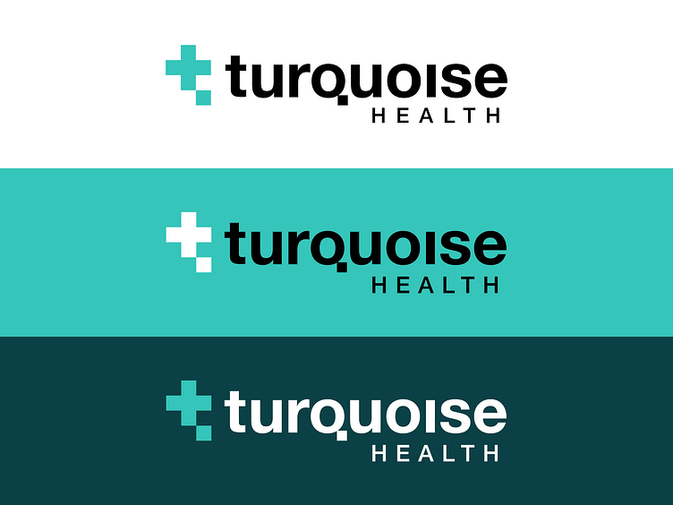
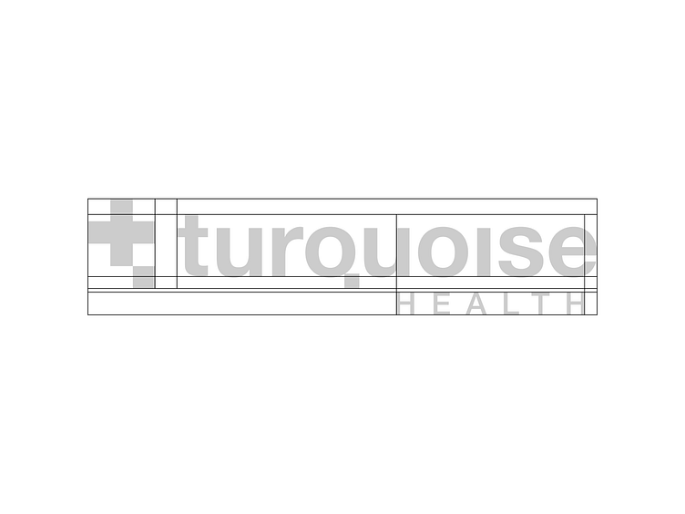
Took a stab at quickly reworking the logo for a friend's company, Turquoise Health. Feedback was that the mark and color palette likely didn't need to change but the wordmark felt generic and was too long to be useable in certain applications. The relative spacing and scaling also struck me as kind of arbitrary. Bringing the glitchy node square element from the mark into the tail of the Q creates a nicer relationship between the two. Deprioritizing "Health" allows the brand name to start standing stronger on its own; and would allow for a nice sub-branding system later on if they wanted to use that line of text for other product lines.