Minimal UI/UX for Weather App Design
We reimagined the weather app—here’s what happened!
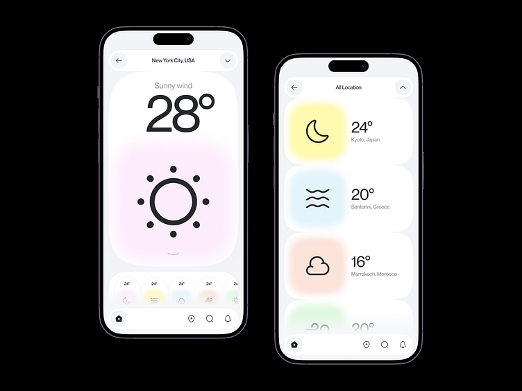
Most weather apps are packed with numbers, icons, and endless details. But do we really need all that clutter? 🤔
We wanted to try something different. What if a weather app could be simpler, cleaner, and feel more refreshing to use? So, we experimented—removing a few elements on purpose to see if we could create a better experience. The result? A minimalist design that still delivers everything you need without overwhelming you.
The UI is crisp, modern, and focused on the essentials—because sometimes, less really is more. We love how this turned out, and we think this approach could change how weather apps are designed in the future.
What do you think? Does simplicity make an app feel better to use? Let us know in the comments! 👇
_____________________________________________________________________________________________________________________________________
↓ Iconic brands invest in notable design
Email:
Website Link:
