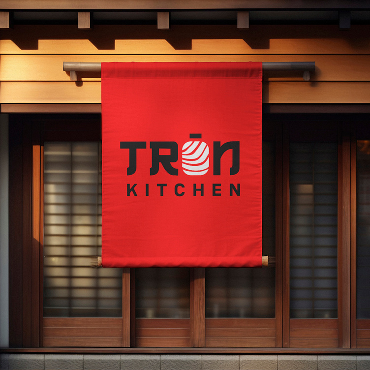
[LOGO DESIGN] TRÒN KITCHEN
Standard Sashimi, standard Japan with Tron Kitchen.
___
Logo | Branding | Brand Identity
Field: Japanese restaurant
____
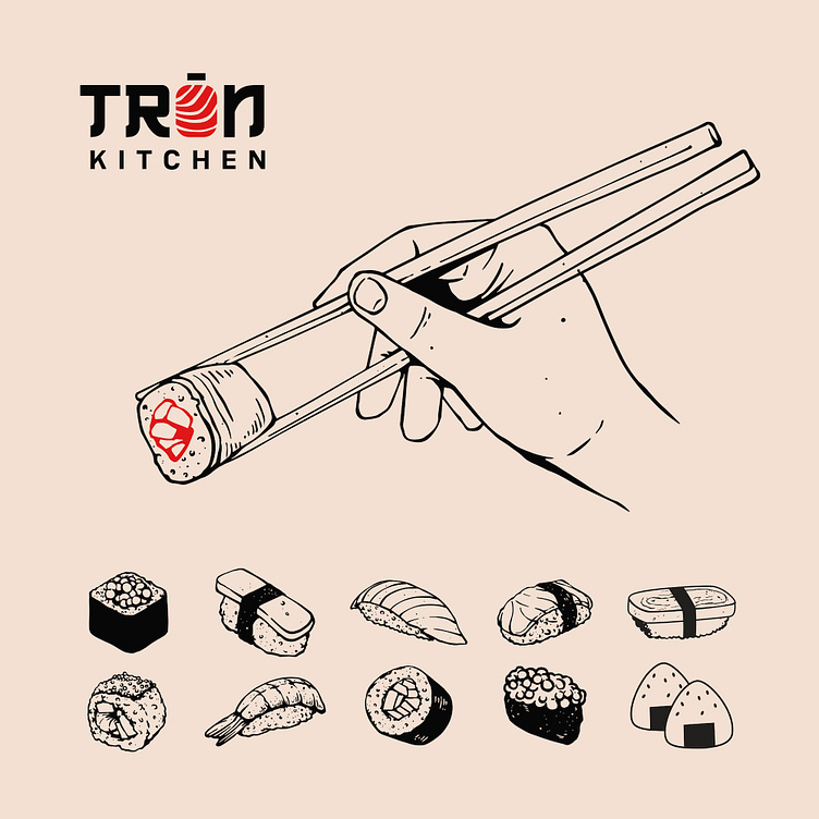
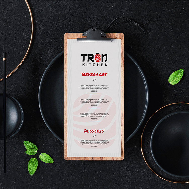
Born with the mission of bringing standard Japanese dishes to Vietnamese diners, Tron Kitchen always focuses on investing in the quality of core products while developing a sustainable brand to affirm its reputation and contribute to the effort to connect Vietnamese and Japanese cultures.
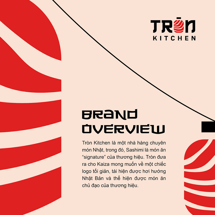
From that foundation, Tron Kitchen came up with the desire for a minimalist logo, recreating the Japanese style and showing the brand's main dish.
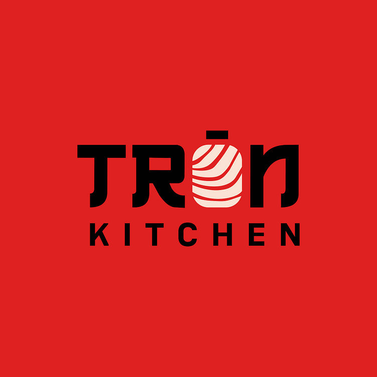
To realize this desire, our creative team came up with the idea of using red and black tones as the main colors for the overall design. In which, the black tone represents luxury and solidity while the red tone is both the color representing the delicious, premium sashimi pieces and stimulating the taste buds.
In addition, a sans-serif, thick, Japanese-style font was chosen to directly represent the culinary culture that the brand develops. Finally, the letter “O” was stylized using the image of a salmon slice to show the brand’s focus on its specialty dish, sashimi.
Designed by Kaiza
Copyright © Kaiza. All Right Reserved
Contact us:
KAIZA CO.,LTD
• P: 0889 996 399
• E: info@kaiza.vn
• W: www.kaiza.vn
Connect me @ Behance - Instagram - Pinterest