Responsive tables
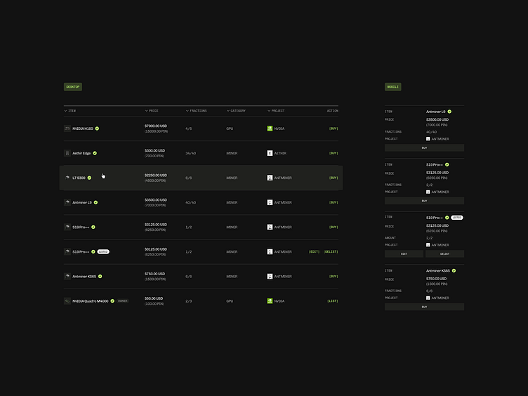
Basic responsive behavior for PinLink list view
Collapsing the table header labels in each row/item on mobile provides the flexibility while staying accessible. Definitely not the most elegant but when you don't want to fuss with overflows and other Javascript tricks, that does the job.
🏓