Coco Logo Contest entries
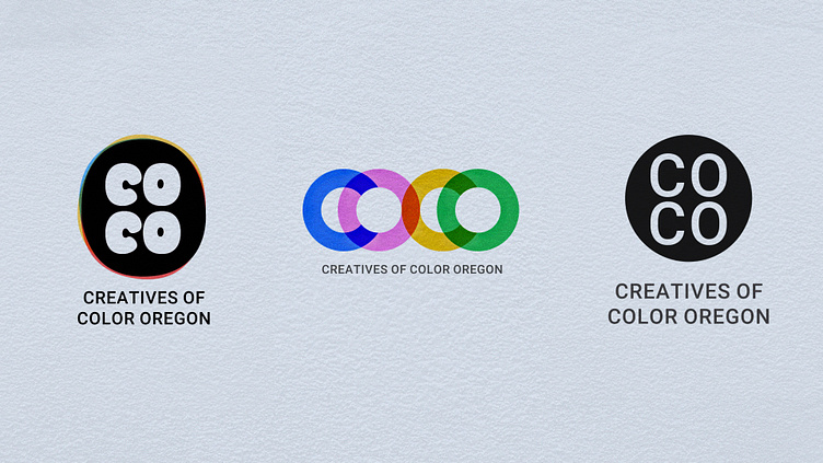
Designed a couple logo entries for OMPA, Coco (Creatives of color Oregon) Contest. Contest has been extended to March 14. More info here
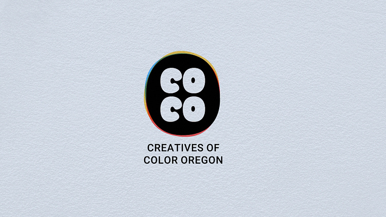
Inspired by a finger print and a wax seal, I wanted to keep the design of coco close to the fun OMPA logo style. The color around it was inspired by chromatic aberration which is a phenomenon that happens in camera lenses when light distorts. As is diversity light is a multi color spectrum that shines brightest when it comes together.
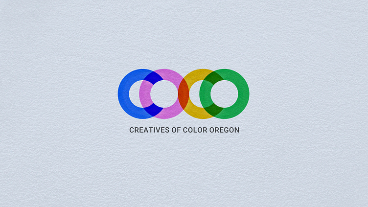
The word Coco has a very particular look when it comes to its geometry. I was trying to be playful with the multiple circles the word contains and color of when the circles intersect each other to spell out COCO.
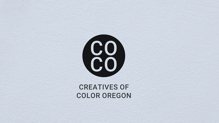
Inspired by a film canister, I did a more traditional but simple logo. Taking advantage of the circular nature of the word COCO putting the CO on top of the CO felt like a natural setup.
