Case study: NebulaTV - A new user experience
First Touchpoint and First Impression
I was watching a video on YouTube when I first heard about Nebula TV. The platform was mentioned in the video, so YouTube was my first place to learn about it. This made me curious, and I decided to check it out. One thing that I really liked was how clean and nice the website looked. This made me want to find out more, so I searched for it on my browser.
This case study talks about my experience as a new user, from discovery to interaction with the web and app platform.
Exploring Nebula TV on the Web
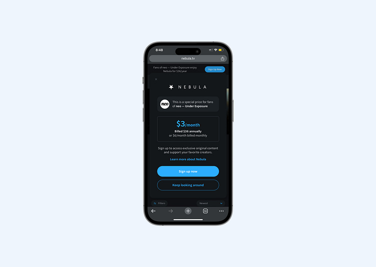
When I opened the Nebula TV website, a pop-up appeared, telling me about the subscription. As a new user, I found this helpful because it gave me clear information about the cost. I liked that Nebula TV didn’t force me to subscribe right away. Instead, there was a "Keep looking around" button that let me explore first (freedom to explore).

Clicking this button took me to the homepage, where I could see all the different kinds of content available. This was great because I could get an idea of what the platform had to offer and whether the content aligned with my interests.
However, when I clicked on a video, it didn’t play. Instead, a small message popped up, telling me that I needed to subscribe to watch anything. This made sense to me, as it clearly explained that I needed a paid plan to access the content.
Checkingout the Nebula TV App
I also saw that Nebula TV had an app, which made me even more interested.
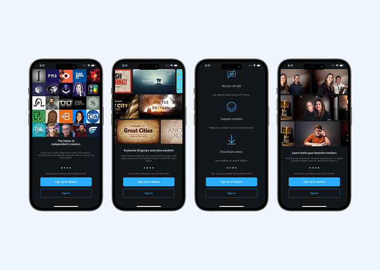
Since I liked what I saw on the website, I went to the App Store and downloaded the app. When I opened it, I was happy to see a simple and well-designed onboarding introduction that explained what my experience would be like on the platform.
A Difference in Experience
I proceeded to sign up for the platform, and everything went smoothly - until the next step.

Unlike the website, where I could look around before deciding to subscribe, the app showed me a subscription page as soon as I signed in. When I went back, i was taken back to the onboarding screens, still asking to be subscribed to the platform. I could not access the app home untill I subscribed. This made me feel a little pressured. As a new user, I was hoping to explore the app first, just like on the website, before being asked to pay.
What could be better?
From a design perspective, this feels like a "dark UX pattern"— which means a design choice that makes users feel pressured instead of comfortable. While I understand that the platform needs to make money, it would be better if the app let users look around before showing the subscription page.
If Nebula TV wants to give new users a great experience, they should make the app work more like the website. Letting people see what’s available before asking them to pay would make them feel more at ease and excited about subscribing.
Final Thoughts
Overall, my first experience with Nebula TV was mostly positive. The design was clean, and they were clear about the subscription cost. However, the difference between the website and the app made things a bit confusing. If Nebula TV makes the app more like the website, allowing users to look around before asking them to subscribe, it could create a better and more enjoyable experience for new users.
