Its Mine Redesign
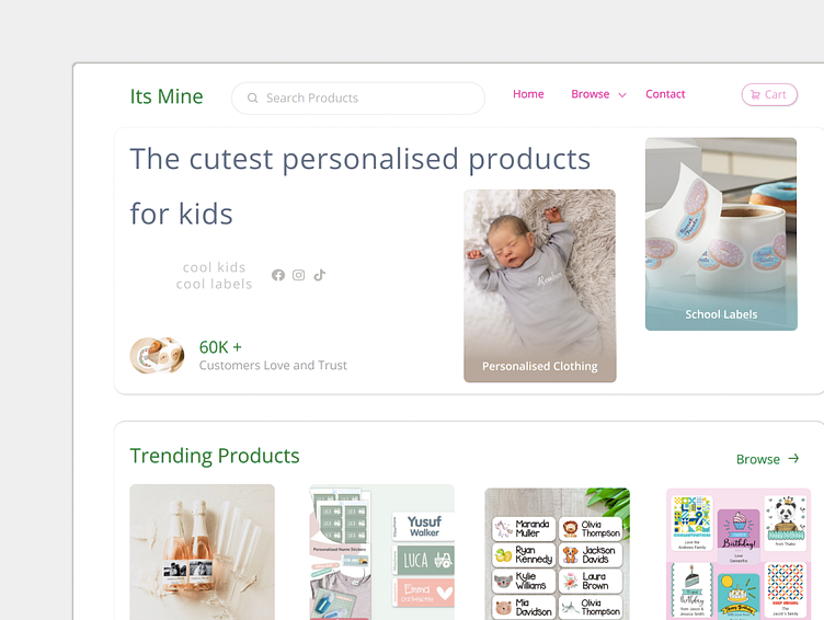
A sneak peak of the UI redesign for Its Mine Labels. They requested a more minimal and modern aesthetic, along with improved product navigation. The design focuses on streamlining the user interface, while incorporating their brand colours.
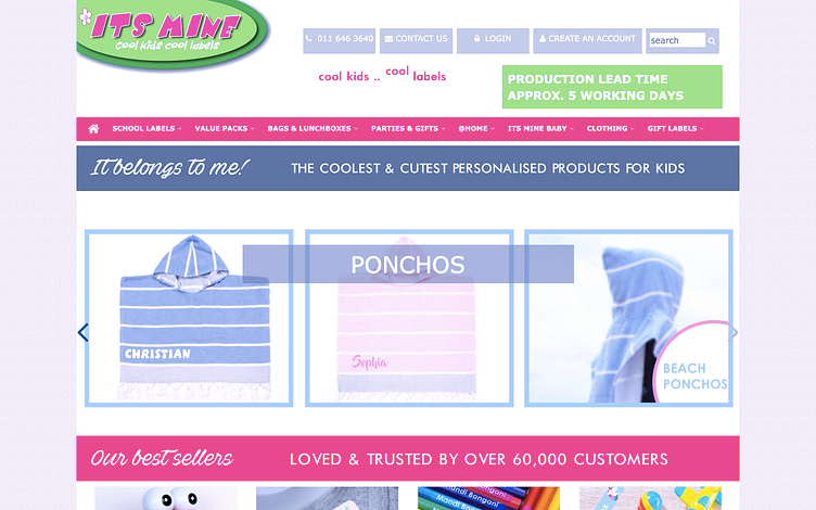
The before:
Thank you!
Be sure to check back for updates.
