Notes App
As part of a university collaboration, my team and I were tasked with creating a collaborative note-taking desktop web application. My role was to design the UI and develop the frontend for the welcome and note pages, while my team focused on the profile page and backend development.
While popular note apps like Notion, SimpleNote, Google Docs, and Word offer unique features, none combine everything users need. My goal was to go further—create a web app that integrates the best features of these platforms.
Research & Key Features
I researched the strengths of popular note apps and combined them into a cohesive design:
Minimalist distraction free interface (SimpleNote and macOS Notes)
Version history
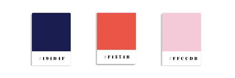
Colour palette that is easy on the eyes
Tasks, checklists, tags, due dates and calendar integration (Notion)
Toggle between views (full-page, grid, list)
Simple navigation with quick access to notes, folders, tasks and search
Markdown support (Obsidian)
Real-time collaboration (Google Docs)
Wireframing & Design
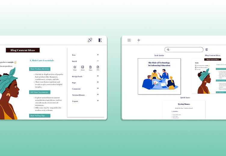
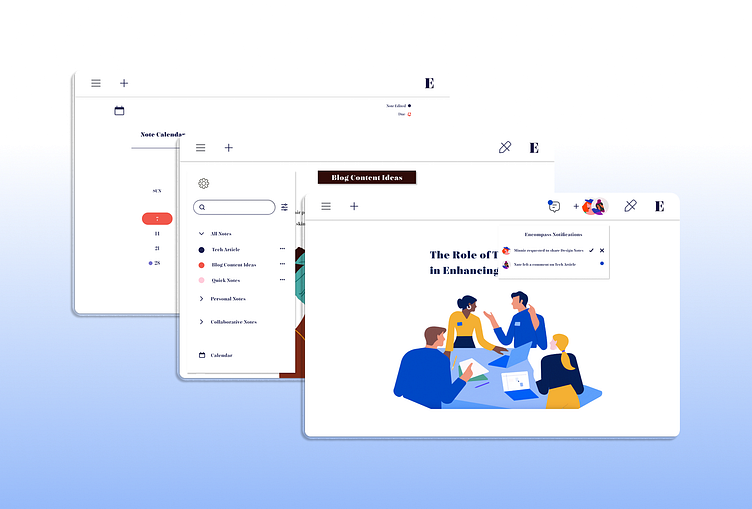
In Figma, I created wireframes to map out the UI, focusing on a clean and intuitive layout. I added a collapsible sidebar to allow easy access to features on every page. Sections for personal and shared notes kept the design organised, and a top search bar improved navigation. I also incorporated hover menus for quick note edits, allowing users to make changes without opening individual notes.
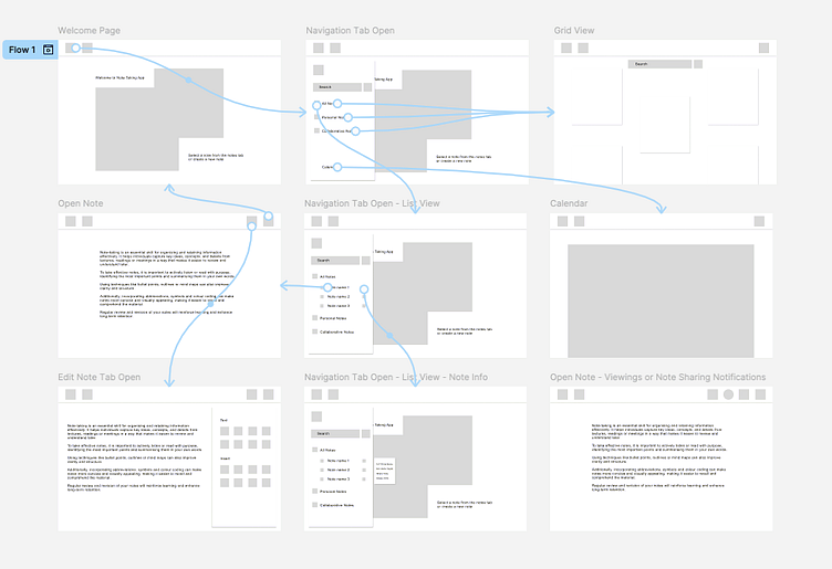
Inspired by Word, I included a large editing tab for excess customisation. Drop-down menus kept icons and text from overwhelming the interface, ensuring a clean design. After finalising the wireframes, I presented them to my team for feedback and approval.
UI Design
I designed the UI in Figma with the following key elements:
Note categories with filtering options
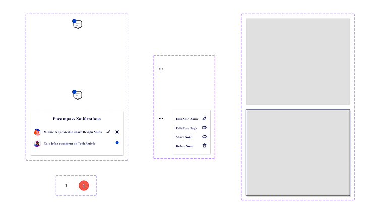
A notification menu for updates on shared notes (comments, requests)
A clean, limited colour palette
A calendar with edited note tags and reminder icons
Quick-access icon for instant note-taking
The name Encompass was chosen by my team and I to reflect its ability to bring together the best features of various note apps into one cohesive platform. I wanted the name to embody the app’s comprehensive nature, offering everything a user needs without overwhelming them.
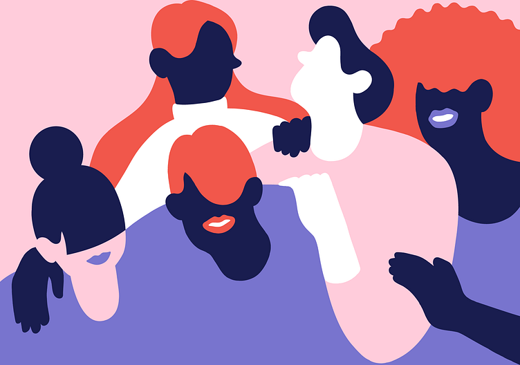
I’ve always loved vector illustrations for their ability to remain minimalist while adding character to a design. For this project, I opted for simple images and focused on integrating them with the three core colours used throughout the app’s interface to maintain consistency and clarity in the overall look.
Prototyping & Testing
After the team approved my designs, I began prototyping the app in Figma. I focused on a smooth user flow and avoided overwhelming effects.
During testing, I refined design elements like improving calendar readability with hover effects. I also adjusted the note interface so the editing tab could open without covering the note, keeping the layout clean yet functional.
Conclusion
This project was a rewarding experience in both UI design and frontend development. Collaborating closely with my team allowed me to create a seamless and user-friendly web app that incorporates the best features from existing note applications.
I’m excited to continue creating innovative and intuitive designs in future projects.
Thank you!
