Legal Point – Law Firm Branding Design
Drop us a line✍️
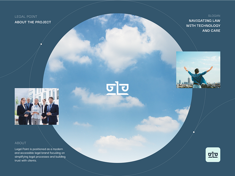
LegalPoint is positioned as a modern and accessible legal brand focusing on simplifying legal processes and building trust with clients. Its core values include professionalism, accessibility, and technological innovation, making it appealing to both businesses and individual clients.
See the whole case below 👇
The logo concept for LegalPoint combines the letter “L” and two “P”s to form the shape of the scales of justice, symbolizing fairness, balance, and legal expertise.
The L serves as the central vertical axis of the scales, representing the solid foundation of law, while the two P’s are creatively stylized to form the arms and balance pans, signifying precision and equality in legal matters.
This modern and minimalist design reflects both strength and approachability, with clean lines and negative space that ensure clarity and versatility. The logo effortlessly communicates the brand’s commitment to justice and professionalism, making it a strong visual identity that works seamlessly across various mediums, from business cards to digital platforms.

The color palette for LegalPoint combines strong, professional tones with softer accents to create a sense of balance and approachability. The primary color conveys authority and stability, while a secondary color adds warmth, ensuring the brand feels welcoming. A contrasting neutral tone is used to enhance legibility and clarity, providing a clean and sophisticated look.
The font is modern and sleek, chosen for its readability and professional aesthetic. It’s simple yet bold, reflecting the brand’s commitment to clarity and expertise. Together, the colors and typography create a unified, contemporary look that positions LegalPoint as both a reliable and approachable legal partner.
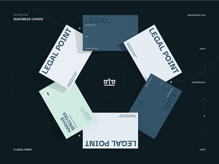
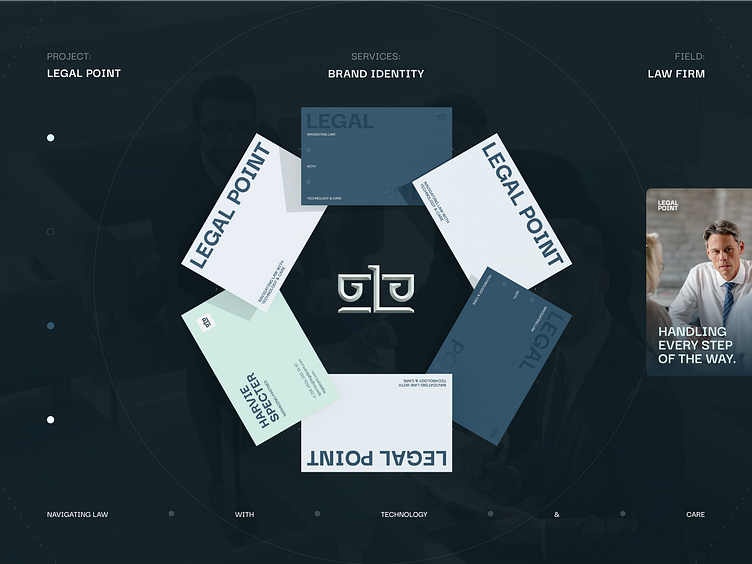
LegalPoint’s stationary design reflects the brand’s commitment to professionalism, clarity, and modern elegance. The design is clean, minimalist, and functional, ensuring that every piece of stationery communicates the brand’s core values while providing a cohesive look across all materials.
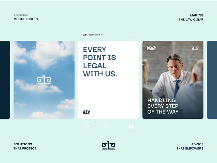
LegalPoint’s social media design is a seamless blend of professionalism and modern aesthetics, crafted to engage and inform its audience. The design incorporates the brand’s signature color palette, using bold tones for emphasis and neutral shades for balance, creating visually appealing and trustworthy content.
Clean, sans-serif typography ensures readability and maintains a polished look, with bold headers drawing attention to key messages. Visual elements such as icons, professional imagery, and abstract legal motifs—like scales or documents—enhance the posts while aligning with the brand’s identity.
Subtle use of the additional visual element across graphics reinforces brand recognition without overwhelming the content.
Overall, the social media design communicates expertise and approachability, making complex legal topics accessible and engaging for businesses and individuals alike.
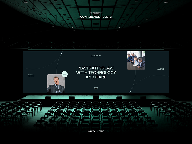
The LegalPoint branding project focuses on creating a professional and approachable identity for a legal services firm specializing in dispute resolution, litigation, and legal guidance for businesses and individuals. The brand combines modern aesthetics with traditional legal values to convey expertise, trust, and clarity.
Key elements include a sophisticated color palette, sleek typography, and a minimalist logo. Stationery and social media designs emphasize clean, functional layouts with consistent use of branding elements, ensuring a cohesive and recognizable visual identity.
The overall approach is to balance professionalism with a modern touch, appealing to a broad audience while highlighting LegalPoint’s commitment to fairness, precision, and client-focused solutions.
👉 Visit our website to see more! phenomenon.com
📮Drop us a few lines at hello@phenomenon-studio.com
