Flash Message
Hello everyone! 👋
I have completed my eleventh study. Flash Message - Daily UI Challenge #011
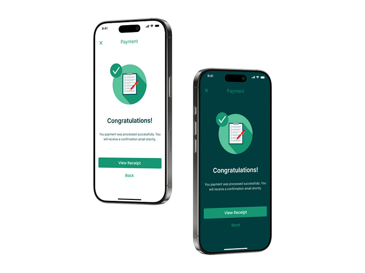
Flash Message UI Design – Light & Dark Mode
In this project, I designed a Flash Message UI for payment confirmations in both Light Mode and Dark Mode. The goal was to create a clean, visually appealing, and user-friendly confirmation screen that seamlessly fits into different interface themes.
1. Visual Consistency:
• Both versions share the same layout, typography, and spacing to ensure a consistent user experience across themes.
• The only major difference is the color scheme, which adapts to Light and Dark Mode settings.
2. Color Contrast & Readability:
• In Light Mode, I used a soft white background with dark green elements to provide clarity and focus. • In Dark Mode, the background is a deep shade of green-black, allowing lighter elements to stand out without straining the eyes.
• The green confirmation icon remains the same in both versions to ensure brand recognition and consistency.
3. Typography & Hierarchy:
• The bold “Congratulations!” heading immediately grabs attention.
• The supporting text is smaller but readable, providing just enough detail without overwhelming the user.
• The call-to-action buttons (View Receipt and Back) are placed intuitively for quick interaction.
4. User Experience (UX) Considerations:
• The green checkmark icon provides instant feedback, reinforcing the success message.
• The button colors are well-contrasted against their respective backgrounds, ensuring clear tap targets.
• The overall design follows a minimalistic and distraction-free approach, keeping the user focused on their action.
Final Thoughts
This Flash Message design is a simple yet effective way to notify users of a successful transaction while maintaining aesthetic harmony in both Light and Dark modes. By balancing contrast, typography, and UX best practices, I aimed to enhance the clarity, accessibility, and user experience of this notification screen.
What do you think of the design? Would love to hear your thoughts! 🚀
