Neo Brutalism - Youtube Exploration

Hey everyone!
So, I've been playing around with Neo-Brutalism for a mobile app design, and it was a total blast! Honestly, it was my first time diving into this style for UI, and I learned so much.
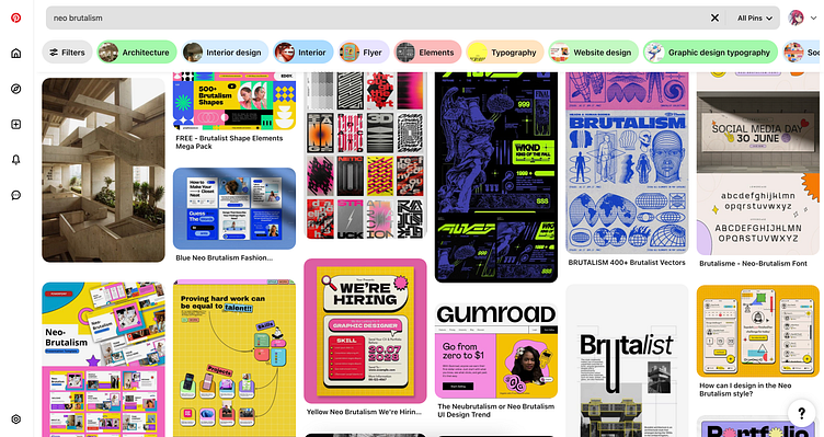
What got me hooked on Neo-Brutalism was seeing it used in graphic marketing. The way they threw together those super bright, clashing colors? It just blew me away! I was like, 'I gotta try this for app design.
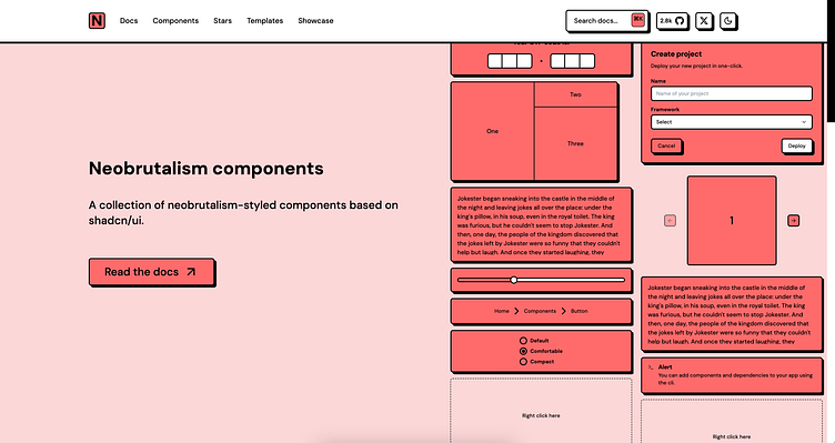
Basically, Neo-Brutalism is all about being bold and a little rough around the edges. Think chunky fonts, in-your-face colors, and layouts that aren't perfectly polished. It's kind of like saying, 'Hey, we're not trying to be fancy, we're just being real.
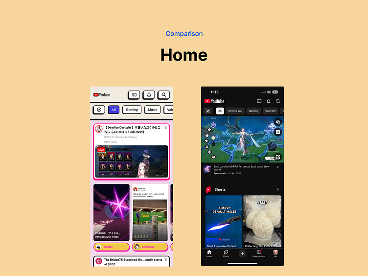
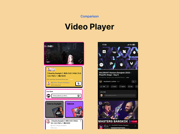
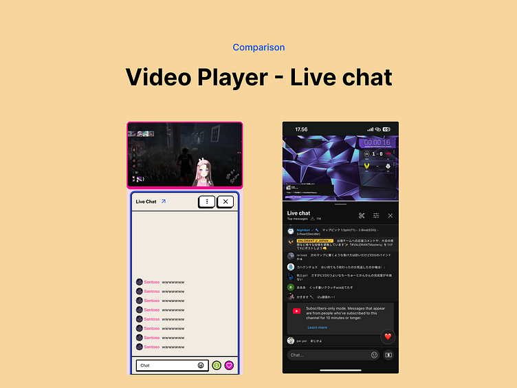
For this exploration, I focused on redesign the existing UI but still using the existing layout [just little bit adjusment :) ]. It was interesting to see how these elements worked in a mobile context.
Anyway, I'm excited to share what I came up with! Let me know what you think.
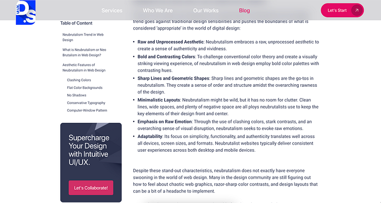
Alright, so first things first, I wanted to get a good grip on what Neo-Brutalism is all about. Like, what makes it tick, you know? I needed to understand its core design principles and characteristics. That way, I could figure out how to actually use it in my designs, while still keeping in mind those UX laws we all love.
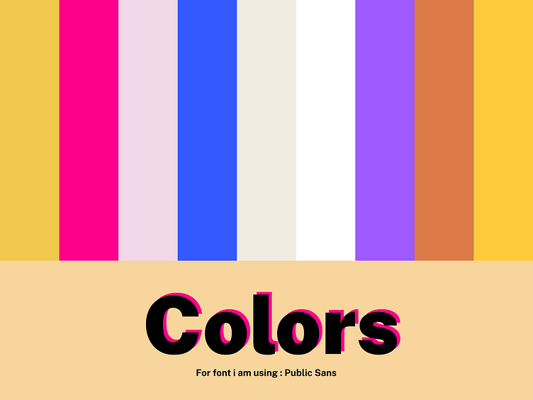
Okay, so for the colors, I basically went with what I personally liked! But, I still stuck to that 60-30-10 rule.
Primary: I went with this super vibrant pink, #FD018B. It just felt right!
Secondary: I kept things clean with a classic white, #FFFFFF.
Complimentary: Then, I just picked other colors that looked good alongside the pink and white to fill in the rest.
Alright, so what do you guys think? Seriously, I'm dying to hear your thoughts! Drop a comment below with your feedback – good, bad, anything! And hey, if you're feeling it, maybe we could even collab on something cool! :D
Source :
