Clean Logo Design for Airvayhost
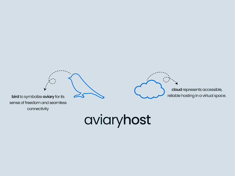
The design is minimalist, clean, and conceptual. It focuses on conveying the brand's meaning and symbolism through simple graphics and clear text. The use of bright blue for the icons adds a touch of vibrancy and visual interest, while the light gray background and dark gray text create a sense of balance and professionalism.
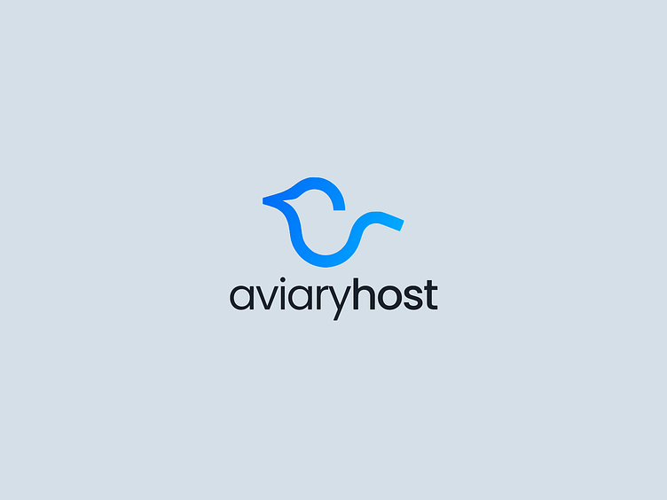
The light blue gradient adds a touch of visual interest and depth. The overall aesthetic suggests a brand that is modern, approachable, and focused on simplicity and clarity.
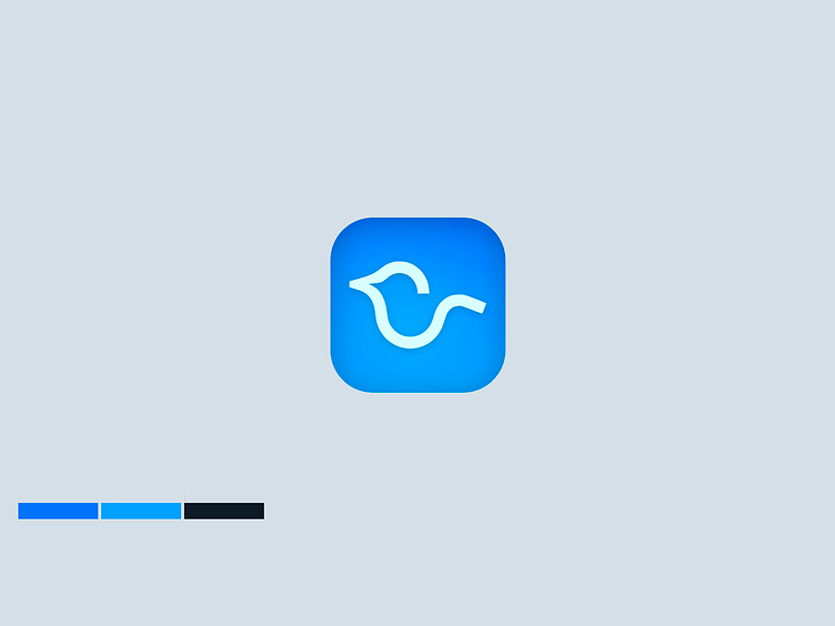
The limited color palette and clean lines contribute to a sense of clarity and professionalism. The overall aesthetic suggests an app that is user-friendly, approachable, and focused on simplicity and clarity. The design effectively translates the "aviaryhost" logo into a format suitable for app icons, maintaining its brand identity and visual appeal.
