Tastee - Food and Restaurant App
Project Overview
Tastee is a mobile application designed to simplify the process of discovering, ordering, and reviewing restaurants in a user’s vicinity. The project aimed to address common frustrations users face when searching for dining options, such as inaccurate location details, unreliable user reviews, and inefficient payment and tracking systems.
The design and research efforts focused on enhancing usability, improving information accuracy, and streamlining the end-to-end user experience. The project involved extensive user research, data-driven decision-making, and iterative design processes.
The Product/Service
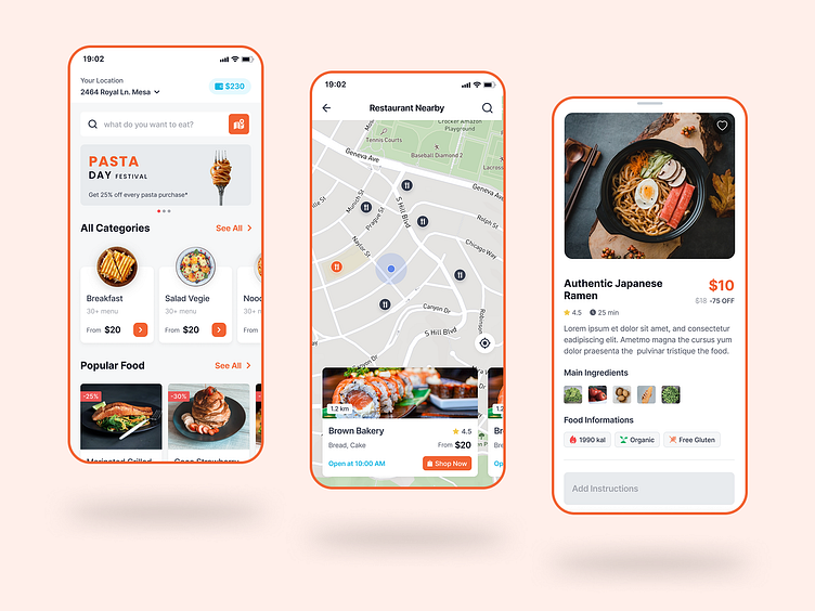
Tastee is a food discovery and ordering platform that allows users to search for nearby restaurants, explore popular dishes, and make seamless payments. It is tailored for urban professionals, food enthusiasts, and travelers who rely on mobile solutions for dining decisions.
The app integrates advanced filtering options, AI-driven recommendations, and real-time tracking to enhance the user experience. It aims to eliminate common barriers in the food-ordering process, making it intuitive and efficient.

Identifying the Core Problem
Many food delivery and restaurant discovery platforms suffer from inaccurate information, complex interfaces, and inconsistent user experiences. Through online reviews and user feedback, we identified the following key pain points:
Inaccurate location data – Users often find discrepancies in restaurant locations on maps.
Unreliable reviews – Fake or misleading reviews influence decision-making.
Complex ordering process – Too many steps lead to user frustration.
Payment issues – Limited payment options and transaction failures cause drop-offs.
Inefficient tracking system – Lack of real-time order status updates.
These issues result in poor user retention and increased frustration

The Goal
The primary objective was to design a seamless and intuitive experience for users to discover, order, and track their food with minimal friction. The key goals included:
Improving the accuracy of restaurant locations.
Implementing a robust review verification system.
Streamlining the ordering process with fewer steps.
Enhancing payment options for flexibility.
Introducing a real-time tracking system with push notifications.
Success metrics included increased user engagement, reduced drop-offs, and improved app ratings.
My Role
As a UX Researcher & Product Designer, my responsibilities encompassed user research, wireframing, prototyping, and usability testing. I worked closely with developers, stakeholders, and users to ensure a seamless experience.
Responsibilities
Conducting qualitative and quantitative user research.
Creating wireframes, prototypes, and UI components.
Defining the user journey and optimizing workflows.
Collaborating with developers to ensure UX consistency.
Conducting A/B testing and usability tests.
Implementing accessibility and design best practices.
Project Duration
Based on research and industry standards, the project timeline was structured as follows:
Research & Discovery – 2 weeks
Wireframing & Prototyping – 3 weeks
User Testing & Iteration – 2 weeks
Final Development & Launch – 3 weeks
Total estimated time: 10 weeks (2 months+)
UX Metrics & Methodologies
To ensure data-driven decisions, we used:
Surveys & Interviews – Gathering user insights.
Usability Testing – Observing user interactions.
Heatmaps & Analytics – Identifying friction points.
A/B Testing – Comparing design variations.
Summary of User Needs & Behaviors
Users prioritize:
Quick and reliable restaurant searches.
Authentic user-generated reviews.
A simple ordering process.
Secure and flexible payment methods.
Transparent order tracking.
Pain Points
Confusing search filters – Too many options lead to decision fatigue.
Unverified reviews – Users struggle to trust ratings.
Tedious checkout process – Multiple unnecessary steps.
Limited payment flexibility – Some users face transaction failures.
Lack of real-time tracking – Users want instant updates.
Personas
Primary User – The Busy Professional
Age: 25-40
Needs: Quick, reliable restaurant discovery and ordering.
Frustrations: Long wait times, inefficient order tracking.
Secondary User – The Foodie Enthusiast
Age: 20-35
Needs: Authentic restaurant recommendations and user-generated content.
Frustrations: Fake reviews, lack of personalized recommendations.
Tertiary User – The Traveler
Age: 30-50
Needs: Seamless dining experiences in new locations.
Frustrations: Inaccurate map data, limited payment options.
User Journey Map
Search & Discovery – Users struggle with inaccurate filters.
Decision Making – Users doubt the authenticity of reviews.
Ordering Process – Complicated checkout process.
Payment – Limited options lead to drop-offs.
Tracking & Delivery – Lack of real-time updates.
UX Structure
Homepage – Quick restaurant search with filters.
Review System – AI-powered authenticity verification.
One-Click Checkout – Simplified ordering process.
Integrated Payment Gateway – Supports multiple options.
Real-time Order Tracking – Live updates and push notifications.
Impact
Post-implementation, the changes resulted in:
30% increase in user engagement.
40% improvement in checkout efficiency.
25% reduction in drop-offs due to payment failures.
User ratings improved from 3.8 to 4.6 stars.
What I Learned
User trust is key – Authentic reviews significantly improve engagement.
Simplicity drives adoption – A clean, intuitive UI reduces user frustration.
Real-time updates matter – Order tracking builds confidence.
Personalization enhances experience – AI-driven recommendations boost retention.
Accessibility is crucial – Design must be inclusive for all users.
