UI/UX for a file management platform
Brief:
The task was to improve the user experience of a file management platform by clarifying the distinction between "Sharing" and "Publishing."
Problem Statement:
Users often struggle to distinguish between "Sharing" and "Publishing" content, which can lead to privacy issues and unintentional exposure of personal information.
The objective is to create a clear and user-friendly solution that enhances the user experience by eliminating ambiguity in content management.
Additionally, the solution should provide users with greater control over content visibility and minimize the risk of accidental sharing with unintended recipients.

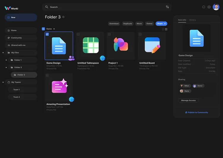
Design Decisions
1. File status badges to visually distinguish:
- Shared, Published, and Private files.
- Status label under the file name (e.g., Shared SmartDoc, Published SmartDoc or Private SmartDoc).
2. File information section in Folder view:
- Quick displays with whom a file is shared.
- Includes quick access to manage permissions.
- Offers a direct Publish to Community button for a streamlined process.
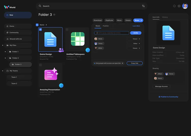
3. A single share button for both sharing and publishing, allowing seamless switching.
4. Sharing and Publishig divided by tabs
5. Showing the risks for privacy issues and unintentional exposure of personal information and adding a checkbox to guide the user to read it. Also I used the text hierarchy to make it stand out.
6. Allowing users to quickly Unpublish the document from the community.

7. Simple and practice share pop-up.
8. Allowing user to share to individuals, teams, or available through link to everyone.
9. Advanced Search option from where you can easily find files shared to a specific person.

10 . Easy Access to shared or published files through Folder Filter


