Music Player
Hello everyone! 👋
I have completed my ninth study. Music Player - Daily UI Challenge #009
Design Analysis
I designed three different music player screens for my MeloCity app. My main goal was to create a smooth user experience while maintaining a modern and visually appealing structure.
On the first screen, users are greeted with a MeloCity Premium banner at the top, highlighting the benefits of the premium membership. The main focus of this page is a featured song from the music list, displayed prominently in the center with its album cover, title, and artist name. Users can like and share the song, and at the bottom of the screen, they can find a list of other songs by the same artist. My goal here was to create an easy music discovery experience, allowing users to explore different tracks from the same artist effortlessly.
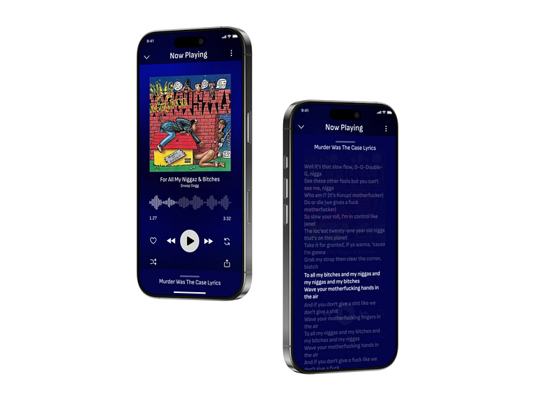
The second screen presents the full-screen now-playing view when a song from the bottom list is selected. I placed the album cover at the center in a large format, ensuring that users can fully immerse themselves in the music. The player controls are arranged similarly to iPhone music apps, offering a familiar experience. To enhance the visual depth, I applied a blurred background effect based on the album cover.
The third screen is accessed by swiping up from the second screen. Here, users can view the lyrics of the currently playing song. To improve readability, I used wide line spacing and designed the lyrics to be highlighted as the song progresses. This allows users to follow along with the lyrics in sync with the music.
Overall, my focus while designing these three screens was to create a clean layout, seamless user experience, and visual simplicity. I wanted users to stay engaged with their music while also having an easy way to discover new songs and interact with the player intuitively.
