UnifiedUI – Toggle Component
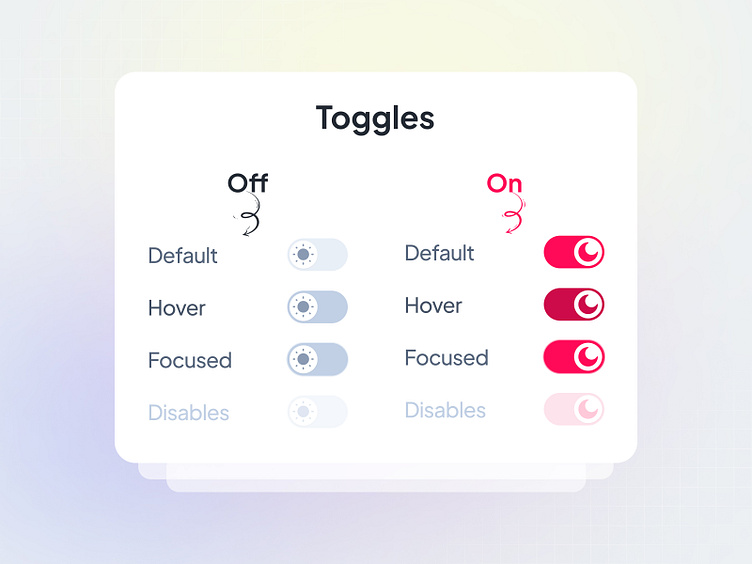
A sleek, modern toggle switch built for seamless interaction and intuitive usability.
Key Features:
→ Effortless State Switching – Perfect for On/Off, Enabled/Disabled, or Light/Dark Mode toggles.
→ Minimal & Modern Design – Enhances any UI with a clean, polished look.
→ Fully Customizable – Easily adjust colors, sizes, and states to match your brand.
→ Accessible & Responsive – Designed for smooth performance across all devices.
Built for scalability, performance, and accessibility, the UnifiedUI Toggle component ensures a frictionless user experience.
Have a look at → www.unifiedui.com
Explore the UnifiedUI Pro and share your insights with us !
Let’s explore your needs — book your free strategy call. 👋
Your information will be secure and confidential.
📮 Email: hello@seative.digital
🗓 Schedule a quick swift chat : https://calendly.com/seativedigital/30min
Hope you like it & “Press L” to show your love❤️