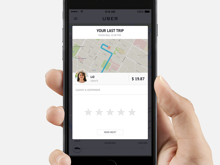
Rating on Uber
A couple of months ago we improved the old rating screen by making visual and interaction improvements to it. Instead of a fullscreen modal, the rating screen is now a card to keep riders within the context of the Uber experience.
We're always looking for great product designers, in Amsterdam as well: uber.com/jobs
More by Uber View profile
Like
