Vokatek - applying vacancy process 💼
You might wonder why I positioned the dropdown button slightly higher, rather than directly adjacent to the action button. This is to improve thumb reachability. Since most people use their phones with one hand, placing the dropdown button too close to the action button can be uncomfortable.

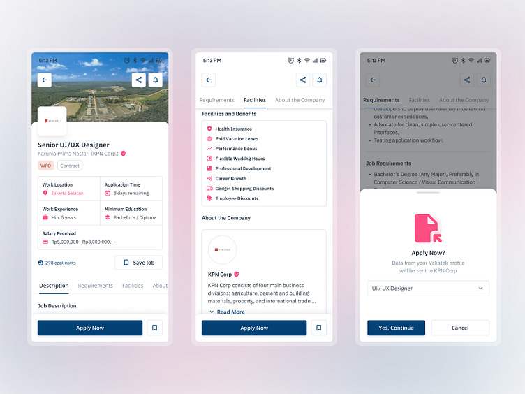
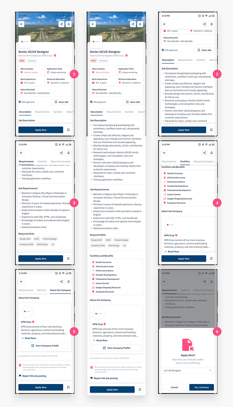
The main action button is positioned on the left side to enhance thumb reachability for right-handed users, placing it within their comfortable interaction area. If a user wishes to cancel the application process, they can simply swipe down on the bottom sheet. A small bar serves as a visual cue, indicating that a swipe-down gesture will dismiss the sheet.
(((Right-handed users)))
So, to make the app more inclusive, I should add an option to switch between right-handed and left-handed design layouts.
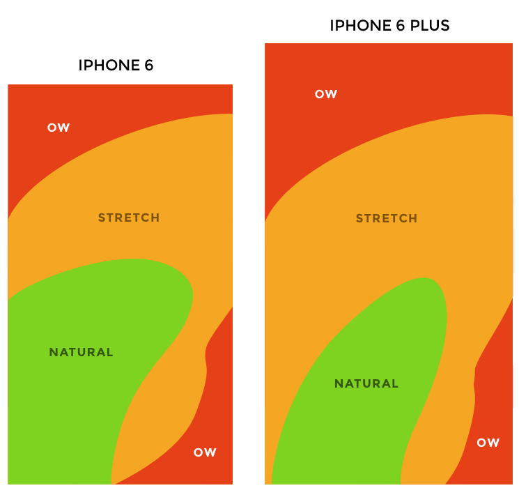
Therefore, instead of prioritizing visual appeal by placing it at the bottom, I opted to position it slightly higher. UX is not only about user behavior within an app, but also about considering the long-term impact of our designs on our users.
Got a vision for
✨ your next project? ✨
Let's bring it to life together
Connect with Us to begin
Behance Team | Dribbble Team | Instagram | Twitter | LinkedIn
Or email Us directly to
⩷⩷⩷
Read study cases of my work | Visit my official website

