Ovolite - Branding & Packaging

Ovolite – Egg Whites, Redefined!
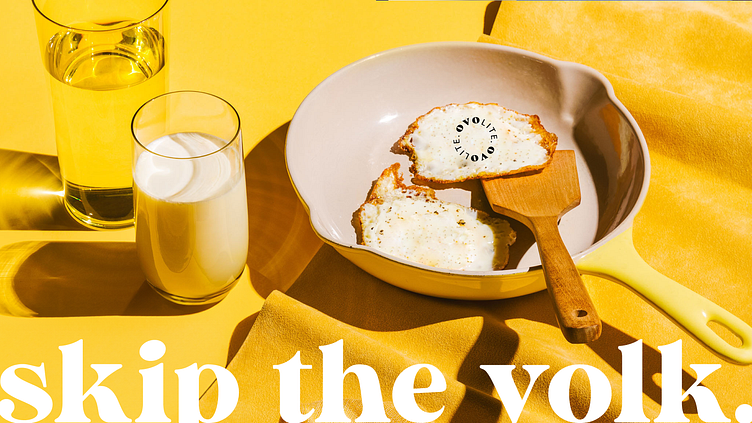
Skip the yolk. Skip the fat. Skip the fuss.
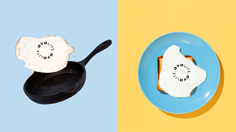
Ovolite is a premium egg white brand that brings a playful yet elegant twist to your everyday protein. Designed with a maximalist approach and a touch of whimsy, Ovolite’s branding stands out on the shelf, breaking the norms of traditional egg packaging. At the heart of Ovolite is a playful fried egg logo where the missing yolk is cleverly represented through negative space in the logotype. The dynamic logo changes shape, just like an egg cracking and falling into the pan, making it a memorable and versatile brand identity.
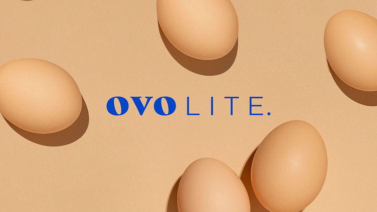
Ovolite – Egg Whites, Redefined!
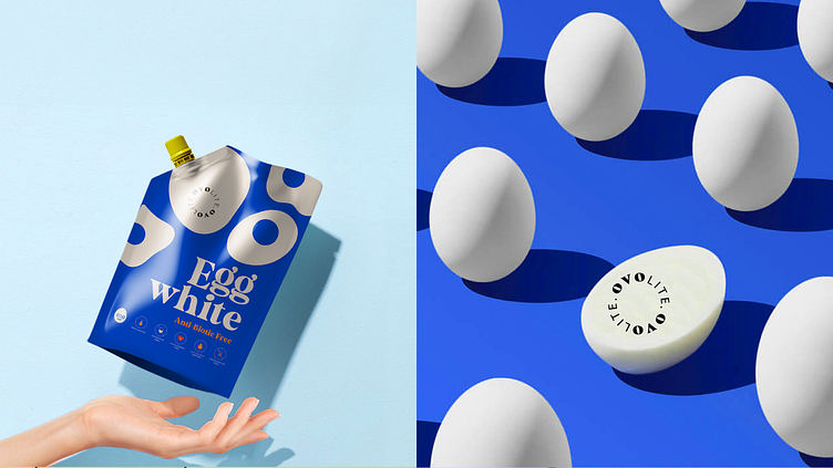
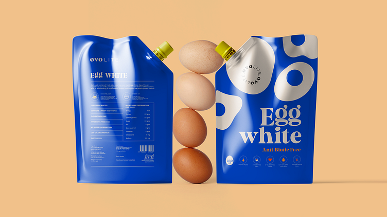
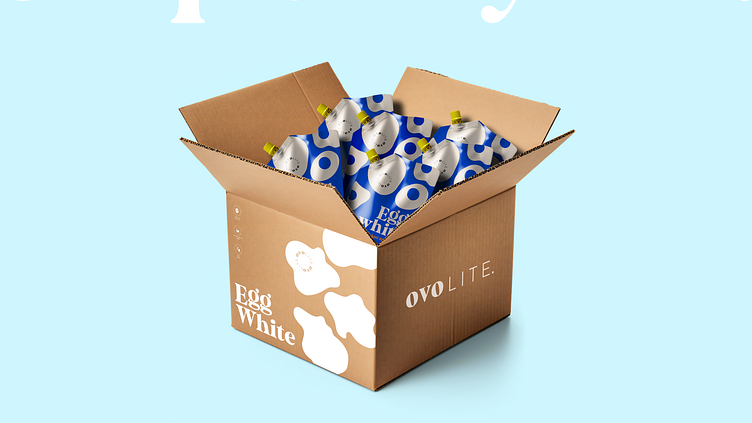
Ovolite brings a playful yet premium twist to egg whites with its dynamic logo and maximalist packaging. A vibrant palette of electric blue and yellow makes it stand out on the shelf.
✉️ Let’s collaborate: namrataskatiyar@gmail.com