Deepseek AI - Mobile App Redesign
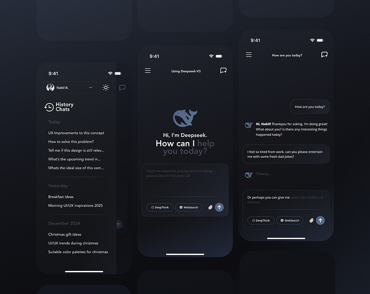
Redesign exploration based on one of the most frequently used apps on my mobile, DeepSeek AI. This redesign is inspired by the struggles I encountered while using their current app design from day-to-day. I felt a few flaws in the experience and some unappealing visual components in its current state. Without drastically changing the core UX (such as button and section placements), I'm making sure that existing users wouldn’t face difficulties adapting to the new design.
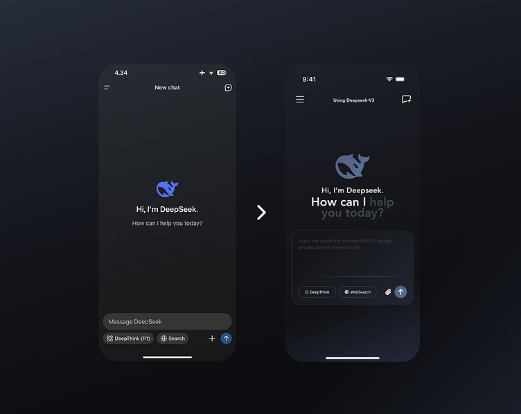
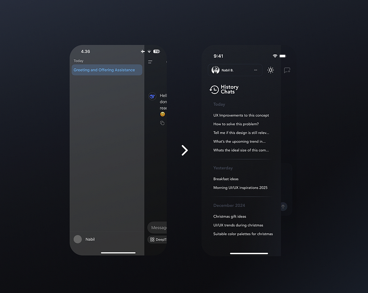
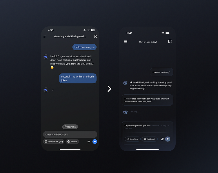
The design is heavily subjective and based on my own experience using similar modern chat-based mobile apps. I believe the user's chat bubble would benefit from using the Deepseek's primary color to create a stronger contrast between the agent messages and the user messages. However, this time I’m exploring glassmorphism more deeply to introduce a fresher look and enhance overall visual consistency across the app.
What do you think of the redesign? let me know your opinion in the reply section😇
