Quickify Delivery Service App Logo Design
Introducing Quickify
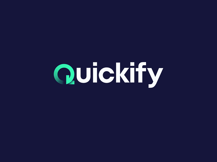
The Quickify logo represents a leading delivery app designed for speed and efficiency. It is built to communicate a seamless, user-friendly experience, emphasizing rapid delivery and modern convenience.
The Challenge
It was meant to design a logo that expresses the idea of "quick" delivery in a way that is easy to remember and recognize. It should also be inviting and warm in design for a mobile application.
The Concept
The prominent "Q" with a downward arrow is the overarching element, suggesting speed and delivery. Bright green gives a sense of energy, efficiency, and affirmative action. Small letters give an impression of friendliness and accessibility.
The Steps
I started by exploring ways to graphically represent "Quickify," highlighting delivery and speed concepts. The "Q" was designed with an integrated arrow to establish a smooth and innovative visual connection to the brand name and its core function. Green was utilized for color to add a visual impact and to represent efficiency and positive things. The lower-case, rounded lettering is appropriate to the clean, modern, and friendly look and feel of the logo.
The Solution
The final design includes a stylized "Q" with a built-in downward arrow and a rounded, lowercase typography. The green color reinforces the concept of speed and efficiency, and the overall design conveys a modern, friendly, and approachable message. The built-in arrow ensures memorability and versatility across various digital media.