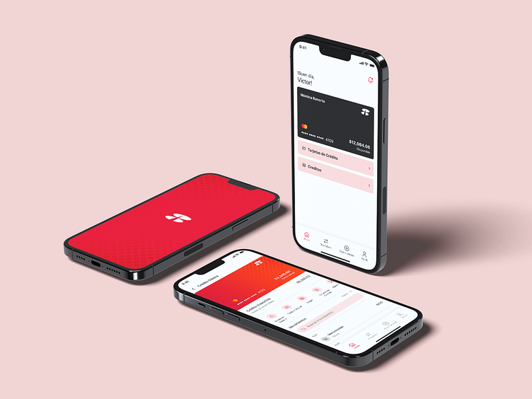
Banorte App

As a product designer, I challenged myself to redesign everyday tools that frustrate users. My first target? My banking app.
The Banorte app is generally robust, as it belongs to one of Mexico’s largest banks. However, it does have some UX issues, such as:
Confusing navigation:
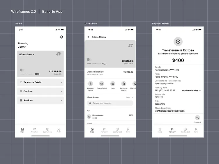
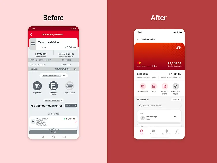
Unclear visual hierarchy on key screens, such as transfers. The 'Confirm' and 'Cancel' buttons sometimes share similar colors or sizes, increasing the risk of accidental errors.
Disorganized menu:
Functions like 'Bill Payments' and 'Top-Ups' are separated, even though they are related actions that could be grouped under a single category.
Insufficient feedback:
When performing an action (e.g., paying a bill), the app doesn’t always display clear visual confirmation (such as a success message or animation) or a completion status. Some users report anxiety due to uncertainty about whether the transaction was completed.
Poor microinteractions:
Slow or missing loading animations, creating the impression that the app is 'frozen'.
Progress bars that don’t indicate remaining time for processes like downloading account statements, leaving users unsure how long the task will take .
Specific Solutions:
Navigation: Reorganize the menu by grouping related functions (e.g., combine "Payments" and "Top-Ups" into a single section).
Feedback: Implement an animated checkmark + success message after completing an action.
Microinteractions: Use progress bars with estimated time remaining or skeleton screens during loading processes.