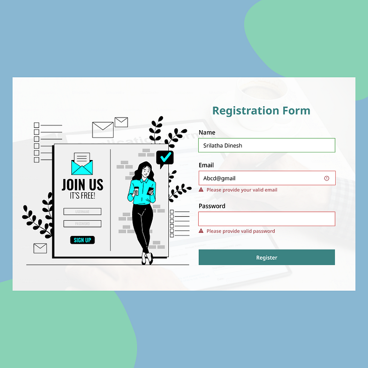
⚠️ Day 21 of #100DaysOfDesign – Error Handling UI ⚠️
🚨 Clear. Helpful. User-friendly.
For Day 21 of my #100DaysOfDesign challenge, I designed a modern error handling UI that ensures users receive clear, actionable feedback when something goes wrong. A well-designed error message can reduce frustration and guide users toward a solution effortlessly.
✨ Key Features:
✔ Minimalist & intuitive design – Keeping messages clear and non-intrusive
✔ Descriptive & user-friendly error messages – No vague "Something went wrong" texts
This static UI concept is designed for clarity, guidance, and a frustration-free experience. What do you think? Drop your feedback below! 💬👇
