Button States
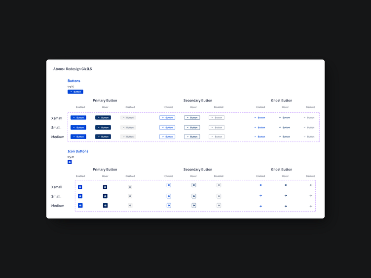
This project is part of a scalable and systematic Button Component System design process. To cover various use cases, three fundamental states (Enabled, Hover, Disabled) were designed for Primary, Secondary, and Ghost buttons.
Key Features:
Sizes: Designed with flexibility in mind, offering XSmall, Small, and Medium options.
States: Each button state (Active, Hover, Disabled) has been carefully crafted to reflect user interaction accurately.
Icon Buttons: Icon-based buttons are included to combine visual simplicity with functionality.
Design Consistency: A unified experience is maintained through consistent colors, spacing, and typography.
This system aims to provide a scalable and modular component library, ensuring a seamless experience for both UX/UI designers and developers.
Your feedback is greatly appreciated!