Github Layout & Hierarchy Spikings
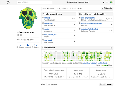


Couple of small ideas that tweaks GitHub’s design. Adjusted the styles in the browser and took screenshots. It’s not perfect, but I think they are a couple of valuable ideas that could help improve the design or spark a useful discussion.
- Logo outside of the grid for the main content to create subtle emphasis.
- Search box left-aligned with the main content to strengthen visual hierarchy from top to bottom.
- Gives navbar links equidistant breathing space on both sides.
- Increases size of headers for emphasis.
- Reduces size of username.
- Removes clock icon for “joined” section.
- Reduces size for number of followers.
- Increases line-height slightly for contribution stats.
- Increases white space for contribution activity stream.
