Verisolar – A Bold & Sustainable Brand Identity
A few weeks ago, the Verisolar team reached out to me to create a modern and impactful brand identity that aligns with their vision in the solar energy and sustainable technology industry. They were looking for a design that represents clean energy, innovation, and reliability while maintaining versatility across digital and print applications.
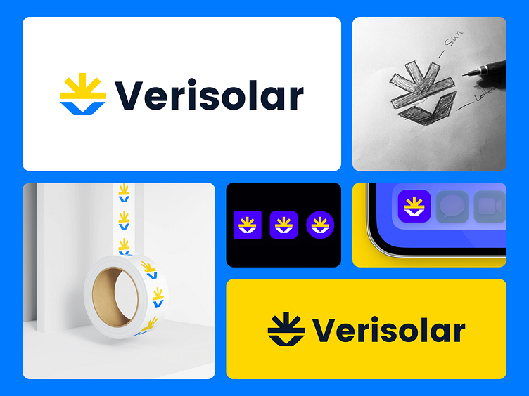
From Sketch to Final Execution
The project began with several concept explorations, where I experimented with different visual representations of solar power and stability. After refining multiple directions, the client finalized this concept, which effectively combines:
• The Sun’s Rays – Representing energy, power, and a brighter future.
• A Strong Base Shaped Like “V” – Inspired by the first letter of “Verisolar”, reinforcing brand recognition while symbolizing stability, reliability, and growth.
Color Psychology & Selection
To reinforce the brand’s personality and message, I carefully selected:
• Yellow – Representing renewable energy, optimism, and innovation.
• Navy Blue – Conveying trust, professionalism, and technological excellence.
For inquiries, DM me or email: helloofahim@gmail.com 📩
