Get a professional website within Budget

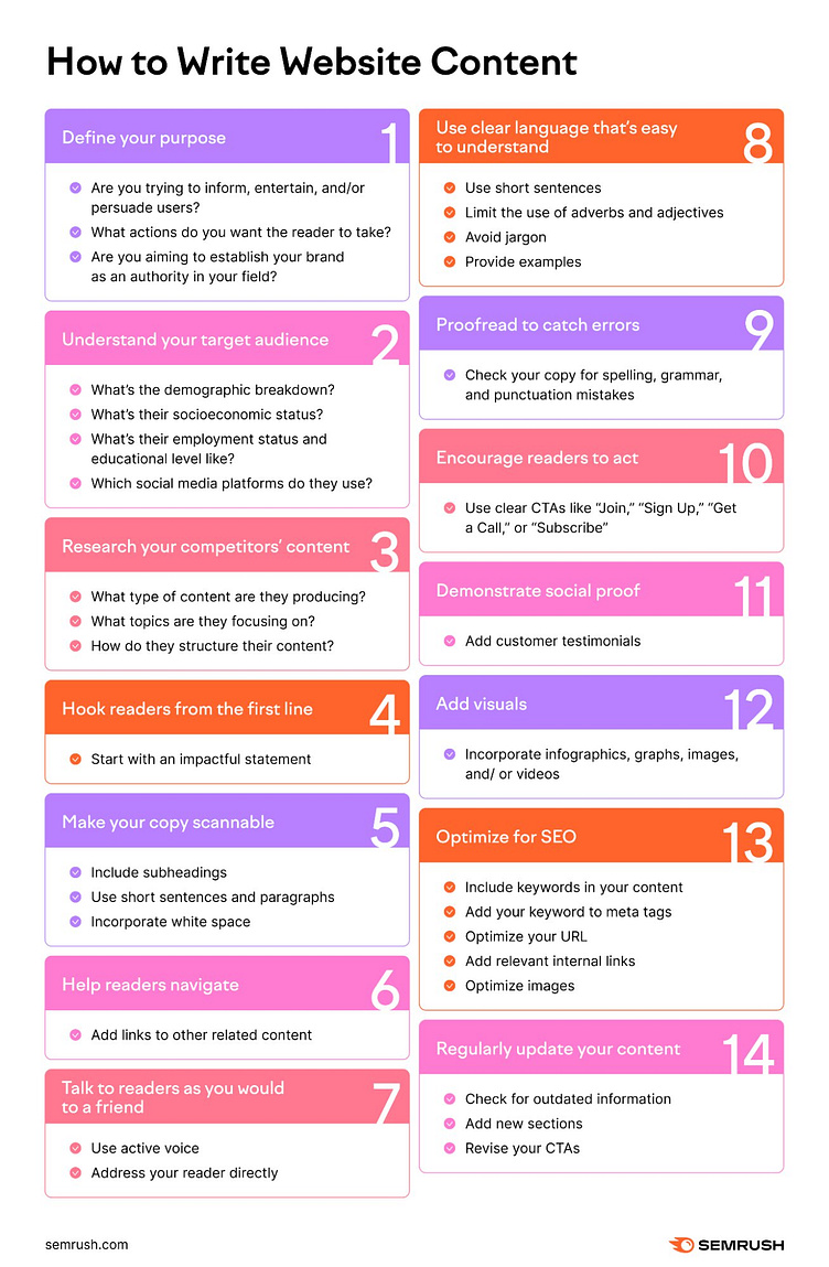
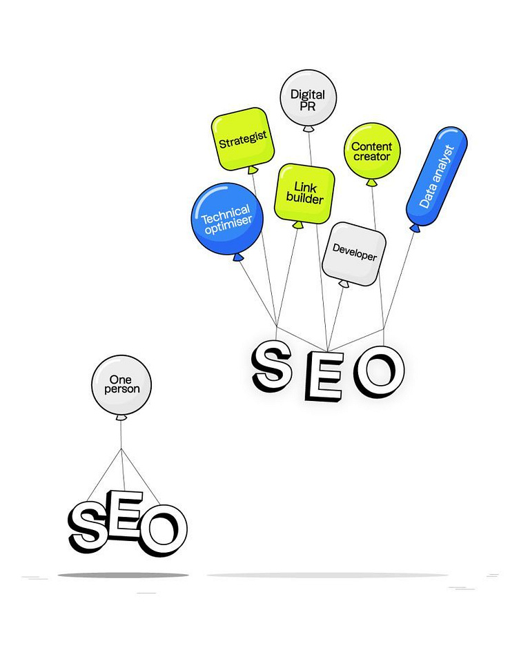
Web Site Content Writing
1. Define Your Purpose:
- Are you trying to inform, entertain, or persuade users?
- What actions do you want the reader to take?
- Are you aiming to establish your brand as an authority in your field?
2. Understand Your Target Audience:
- What’s the demographic breakdown?
- What’s their socioeconomic status?
- What’s their employment status and educational level like?
- Which social media platforms do they use?
3. Research Your Competitors’ Content:
- What type of content are they producing?
- What topics are they focusing on?
- How do they structure their content?
4. Hook Readers from the First Line:
- Start with an impactful statement.
5. Make Your Copy Scannable:
- Include subheadings.
- Use short sentences and paragraphs.
- Incorporate white space.
6. Help Readers Navigate:
- Add links to other related content.
7. Talk to Readers as You Would to a Friend:
- Use active voice.
- Address your reader directly.
8. Use Clear Language That’s Easy to Understand:
- Use short sentences.
- Limit the use of adverbs and adjectives.
- Avoid jargon.
- Provide examples.
9. Proofread to Catch Errors:
- Check your copy for spelling, grammar, and punctuation mistakes.
10. Encourage Readers to Act:
- Use clear CTAs like “Join,” “Sign Up,” “Get a Call,” or “Subscribe.”
11. Demonstrate Social Proof:
- Add customer testimonials.
12. Add Visuals:
- Incorporate infographics, graphs, images, and/or videos.
13. Optimize for SEO:
- Include keywords in your content.
- Add your keyword to meta tags.
- Optimize your URL.
- Add relevant internal links.
- Optimize images.
14. Regularly Update Your Content:
- Check for outdated information.
- Add new sections.
- Revise your CTAs.
🚀 Level Up Your Web Design Game!🚀
Are you ready to optimize your online presence and create a seamless user experience?
As a passionate web designer, I believe in the power of responsive design to transform websites across all devices.
Here are a few best practices to get you started:
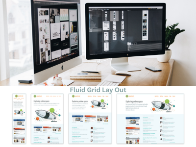
1. Fluid Grid Layout: Adapts your content to different screen sizes.
2. Flexible Images and Media: Ensure visual elements scale beautifully.
3. CSS Media Queries: tailor styles based on device characteristics.
4. Responsive Typography: Maintain readability with scalable fonts.
5. Mobile-First Approach: Prioritize essential content for mobile devices.
6. Touch-Friendly Elements: Enhance usability with well-sized interactive elements.
7. Performance Optimization: Boost loading times with efficient code.
8. Consistent User Experience: Keep navigation and functionality coherent.
9. Real Device Testing: Regularly test on various devices.
10. Accessibility: Follow web accessibility guidelines for all users.
By following these practices, you can create a responsive web design that offers an enjoyable experience for every visitor. Ready to take your web design to the next level?
Reach out to me today!
#WebDesign hashtag#ResponsiveDesign hashtag#UserExperience hashtag#SEO hashtag#DigitalMarketing hashtag#WebDevelopment hashtag#UXDesign hashtag#Accessibility hashtag#Optimization