Airport Boarding Pass

I wanted to refine how boarding pass information is presented, making key details stand out while keeping the layout clean and easy to scan. Did I succeed? Let me know your thoughts.
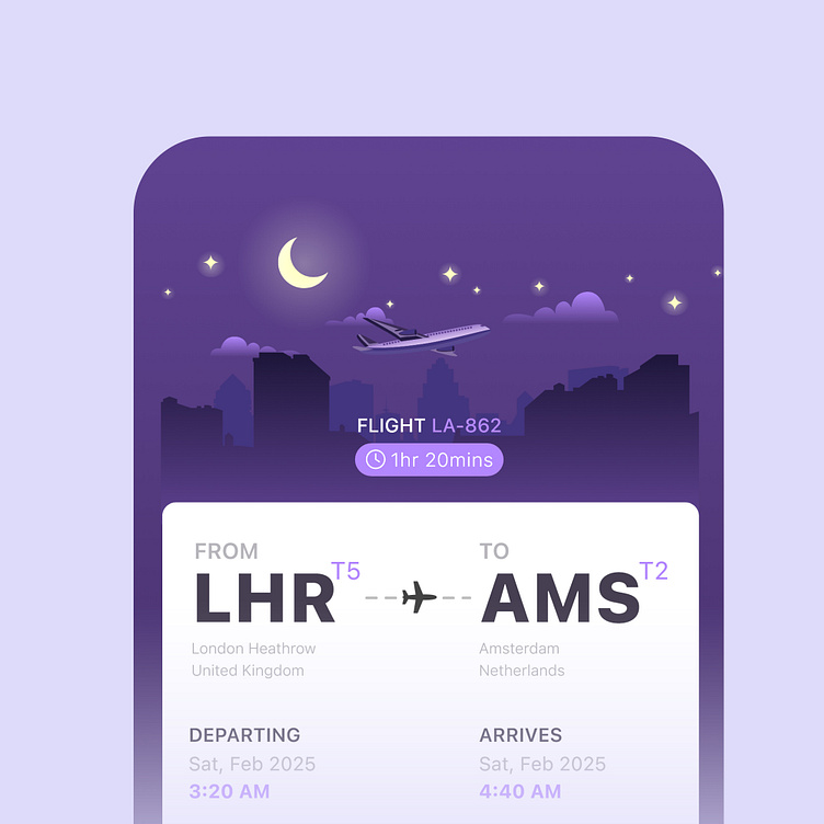
Unlike existing designs (such as airlines EasyJet) I wanted to add a bit of personality without overwhelming the design. By adding a subtle nighttime skyline with a moon in the header, I hoped it would playfully acknowledge the early morning departure in a way that feels natural.
Ultimately, the focus was on clarity and small thoughtful touches that enhance the experience without adding unnecessary complexity.

#DailyUI #DailyUI25 #BoardingPass