Interior Design Brand Indentity

This visual identity came together so naturally. I started with the feeling I wanted the brand to evoke; warmth, comfort, and a sense of home, and that guided everything, from the logo’s typography to the colour palette.
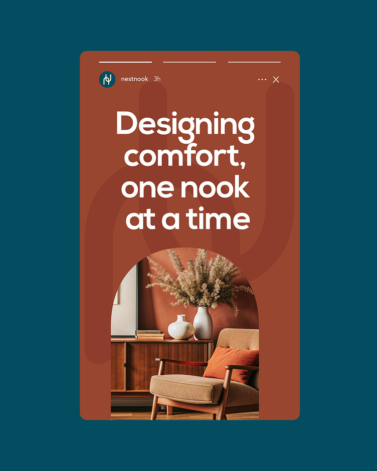
The arch frames aren’t just a design choice; they mimic doorways, symbolizing the feeling of stepping into a welcoming, thoughtfully designed space. The earthy tones, Warm Linen, Rustic Brick, and Midnight Haven, add a cozy, grounded feel, while the smooth, rounded typography makes everything more inviting.
Every detail works together to make Nest & Nook feel like a warm hug, a place that’s not just stylish but truly feels like home.