Poetry in Type: A Typography Exploration
Typography is more than just letterforms: it’s emotion, rhythm and storytelling. Poetry in Type is an exploration of how fonts can embody the essence of a poem, capturing both its vulnerability and power through shape, weight and composition.

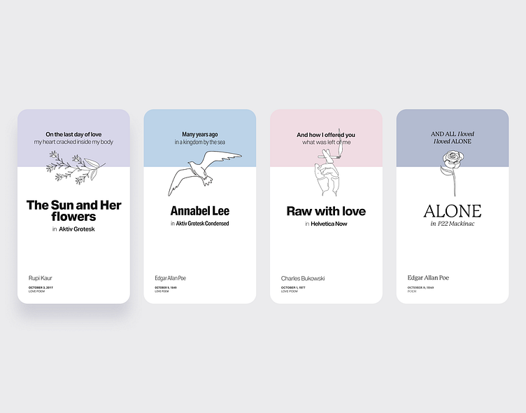
Commitment from The Sun and Her flowers uses Aktiv Grotesk, a bold and unassuming choice that mirrors the quiet strength of commitment itself. When fully embraced, it takes on an unexpected form: steady, adaptable and beautiful in ways that aren’t always immediately seen.

Raw with love embraces the rawness of Bukowski’s words with Helvetica Now. A typeface often seen as structured, neutral and even "boring" to some. But much like the vulnerability hidden beneath a rough exterior, it reveals unexpected depth when truly seen.
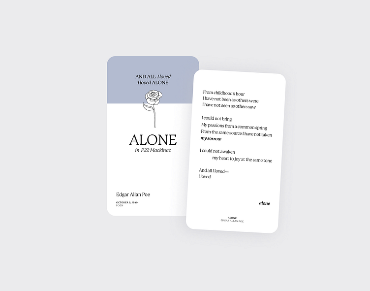
Alone uses P22 Mackinac, its elegant yet sharp edges evoking both the beauty and solitude of a single rose—a parallel to the kind of love that exists in isolation, self-sustaining yet longing for something more.

For Annabel Lee, Aktiv Grotesk Condensed stretches through a central composition. Tight, controlled and filled with longing. There’s a distant familiarity in its form, trying to capture the scent of salt in the air while standing on a cliff’s edge, heavy with memory and devotion.

Through seemingly unexpected pairings and intentional layouts, this project embraces the challenge of type as expression. I wanted to explore how typography is more than just a vessel for words, it amplifies their power, shaping how they are felt and not just read.
