Insurance Calculator - UI Guide
Reposting due to a handful of glaring discrepancies on my previous post.
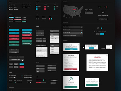
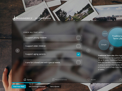
This is a breakdown of the UI for the insurance calculator that I worked on a while back. I don't often really enjoy working with dark palettes but am overall happy with the results.
Large view attached.
More by Ben Suarez View profile
Like


