Grok Logo Re-Design
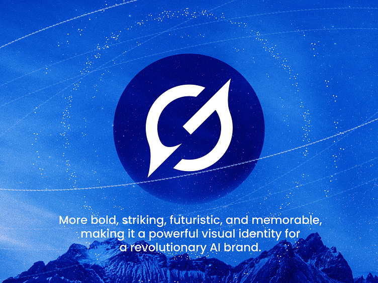
Grok recently unveiled a new logo, and I have redesigned it to be bolder, stronger, and more dynamic, aligning seamlessly with the AI industry’s cutting-edge nature. The thick, uniform strokes convey strength and reliability, while the sharp diagonal cut represents innovation, progress, and breakthrough thinking. The circular structure symbolizes intelligence and continuity, with subtle asymmetry reflecting adaptability—an essential trait of AI. Unlike the original logo, which lacks a commanding presence, this redesign is more striking, futuristic, and memorable, making it a powerful visual identity for a revolutionary AI brand.
Your brand’s story starts with its logo!
Let’s make it
unforgettable!
DM me or send an email
your next iconic logo is just a message away!
👉 daudhasan313@gmail.com
👉You can get my service on 👉 Linkedin
📖Read my Client's Recommendations
👍 Follow me on Instagram
👍Check out my Behance profile
👍 Follow me on Twitter
👍 Follow me on Pinterest
