Building a Design System: Buttons & More


"Buttons do more than trigger actions—they define interactions, guide users, and enhance accessibility."
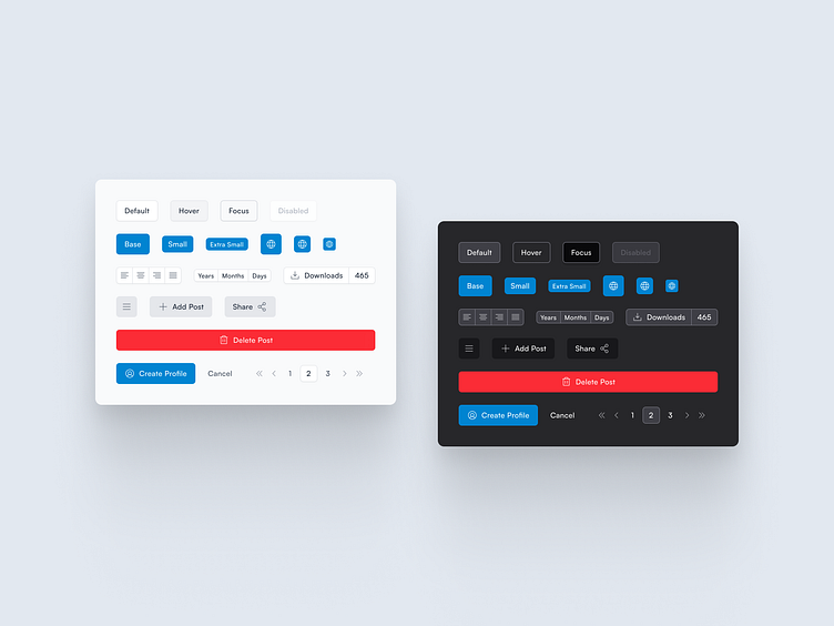
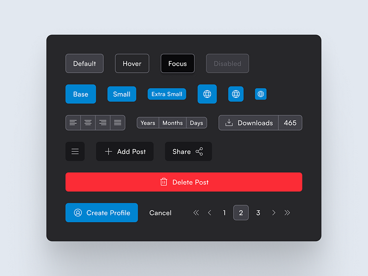
This Button System UI is crafted for consistency, scalability, and adaptability, making it a core element of a design system.
✅ Light & Dark Mode Variants for seamless integration
✅ Multiple Button Sizes & States – Default, Hover, Focus, Disabled
✅ Action Buttons – Primary, Secondary, Icon, and Link Buttons
✅ Functional Variations – Pagination, Filters, and Toggles
✅ Scalable & Reusable Components for any project
By ensuring modular flexibility, this button system seamlessly adapts across dashboards, apps, and web platforms.
💬 Which button style do you prefer—solid, outlined, or ghost? Let’s discuss below! ⬇️
DM to get tje Figma file for this and other components in this design system. Comment if you want to learn how to make such UIs.