Finance Mobile App Design
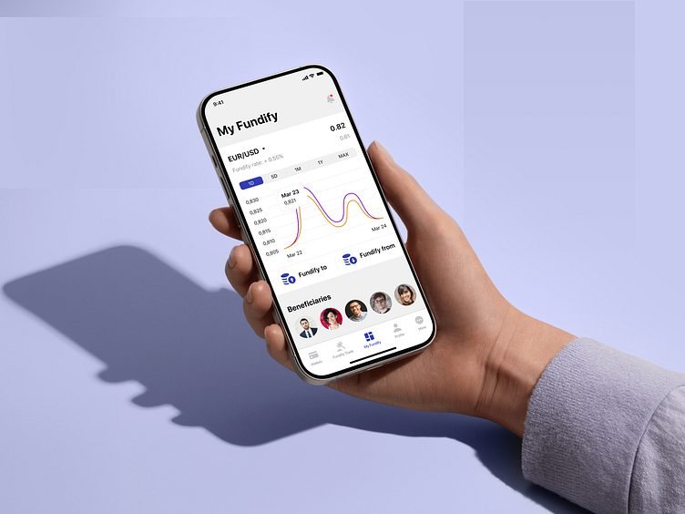
🎨 Choosing the right colors and fonts is key to creating a trading app that feels trustworthy and easy to use. A thoughtful color palette with teal and turquoise can guide users’ focus, highlight important data, and convey a sense of security, which is so important for financial tools.
Pairing this with clean, modern font ensures the app looks professional and stays easy to read, helping users navigate confidently and make decisions with ease.

Thank you for being with us! ❤️
Want to expand your business? We're ready to help.
Contact us ☎️ | Visit Our Website 🌎
Discover more about us: