XV curso COT
inspiration
This medical education brought together over 90 professionals and stood out for its innovative approach to robotic surgery, regenerative therapies, and accelerated recovery, which inspired a visual identity reflecting technological evolution in orthopedics. The design was crafted not only to stand out in physical formats but also to maintain a strong, consistent presence in online broadcasts. This ensured that the visual impact remained constant, aligning with the event’s modern vision and focus on technological innovation, making the design as adaptable as the course itself.
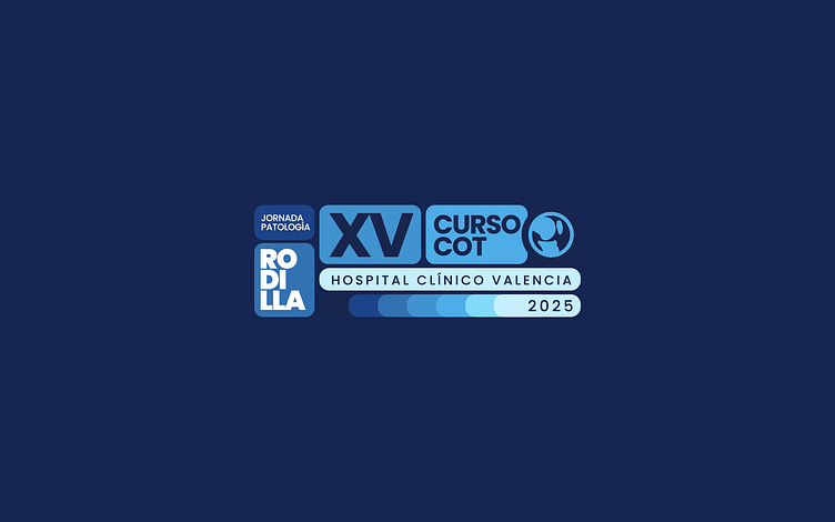
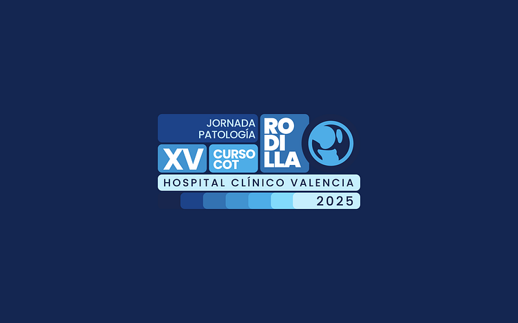
The graphic identity of the XV COT Course was based on visual modularity, using rectangular modules with rounded corners that adapted to both vertical and horizontal formats. The blue tones (#5FDDFF, #0874B7, #142651) conveyed a message of innovation and technology, blended with greys for a visual balance that worked on both light and dark backgrounds. The Poppins typeface, used in various weights, created a visual hierarchy that highlighted key elements such as “XV COT Course” and “Knee.” The graphic synthesis of the knee, emblematic of the event's pathology, was incorporated into the logo with a symbolic and visually impactful approach.