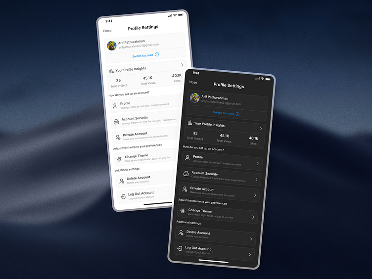
Profile Settings Mobile App UI

Hello, everyone!👋🏻✨
Today I will share the results of my UI design. Today is Day 6 of the 100 days #DailyUI challenge. Today I created a profile settings design app. I hope you all like it.
Why did I design it this way?🤷🏻♂️
In designing the UI of the profile settings screen, there are some UX law concepts that I applied, namely Hicks Law. Hicks Law states that “The more options, the longer it takes users to make a decision”, so I arranged the options carefully, starting from the menu is arranged hierarchically and there are not too many options in one screen, Each category (e.g. Account Settings, Theme, Additional Settings) is clearly separated to avoid confusion, and the short description under each option helps speed up decision making.
Then, is it only Hicks Law? 🤔
Of course not. Aside from Hicks' law, there are several laws that apply. There is Fitt's law that states “The smaller and farther away an element is, the harder it is to click”, therefore I made the display of all interactive elements (such as Switch Account, Change Theme, Delete Account) large enough to be easily accessible and the distance between elements is not too tight, thus reducing the risk of mis-clicking. Then, there is Jakob's law. Jacob's law states “Users expect the design to work like other apps they are already familiar with”, so I made the UI design of Profile Settings design similar to the settings in other popular apps like Instagram, Twitter, or Dribbble and the use of icons is very important.
Is the explanation clear? 🫱🏼🫲🏻
If the explanation is clear, that's it. But if you have any suggestions or feedback, write them in the comments section! Thanks!😎
