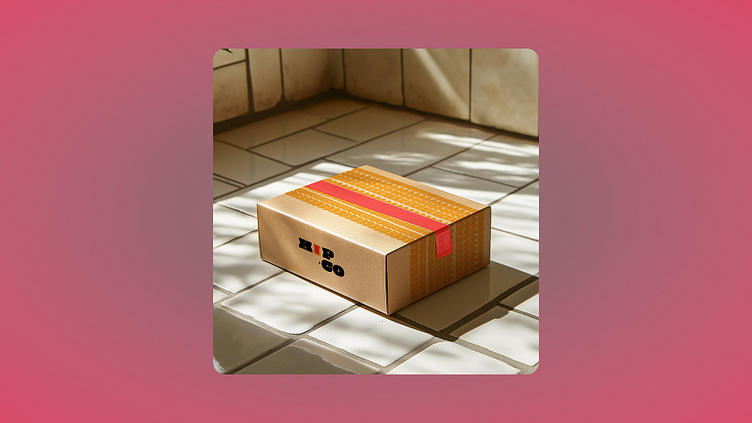
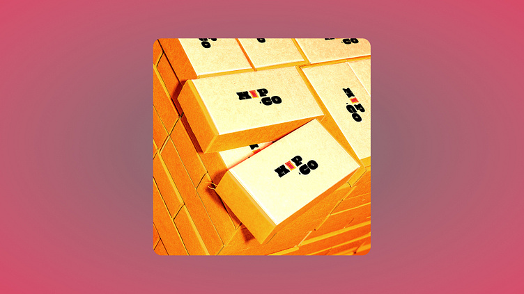
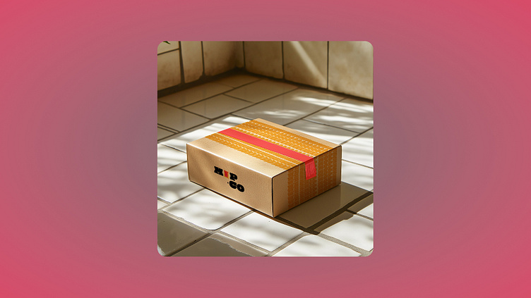
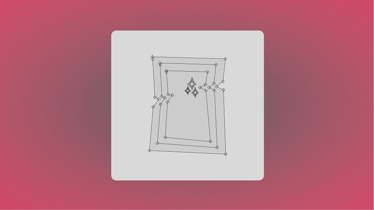
Mop.co : A Cleaning Company Logo
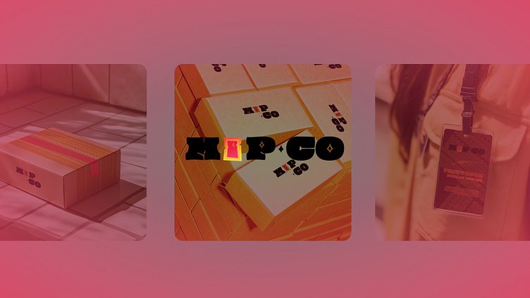
About the company:
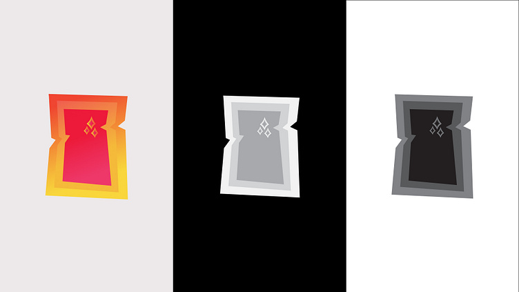
Mop.co is a fictional company that cleans servers that mo.co (a game) is hosted on and their discord server. The idea for the logo was to take the original logo of mo.co and make it look more clean, bright and bigger. The base of the logo symbolizes a clean portal with 3 parts of it. The portal looks a little tilted because there is a certain instability about portals. Three stars symbolize the cleanliness of the portal.