Button & Documentation - UI Kit
Introduction
Buttons are key elements in the user experience, serving as essential interaction points within a digital interface. More than just visual components, their strategic design shapes the flow and accessibility of navigation, intuitively guiding users toward specific actions. A well-designed button not only highlights its purpose but also enhances usability, ensuring a smooth and efficient experience.
Overview
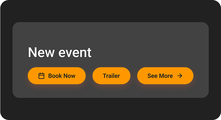
1 - Can contain an optional leading icon
2 - Five types: elevated, filled, filled tonal, outlined and text
3 - Keep labels concise and in sentence-case
4 - Containers have fully rounded corners and are wide enough to fit label text
Anatomy
The anatomy of a button in a user interface includes several essential components and features for its design and functionality:

1 - Container
2 - Icon left (Optional)
3 - Label text
4 - Icon Right (Optional)
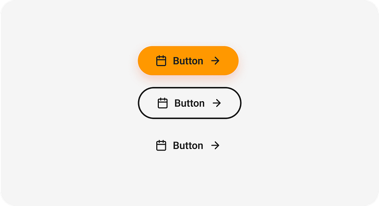
Variants component
Each button variants has specific function, and it’s design indicates that function to the user. Therefore, it’s important to implement the different variants consistently across all products to ensure they comunicate the correct actions.
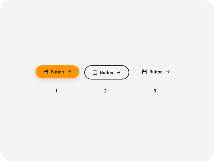
1 - Primary
2 - Secondary
3 - Borderless
Primary Button
Description: This button is the most prominent and is designed for primary actions on a page.
Usage: Use it for the primary action in a flow, such as submitting a form or making a purchase.
Features:
Solid background with high contrast.
Text is always readable on any background.

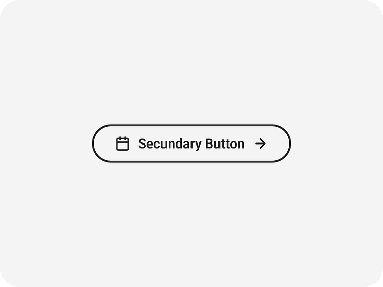
Secundary Button
Description: A supporting button that complements the primary action.
Usage: Ideal for secondary or less critical actions.
Features:
Visible outline with a transparent background.
Text color adapts to the outline.
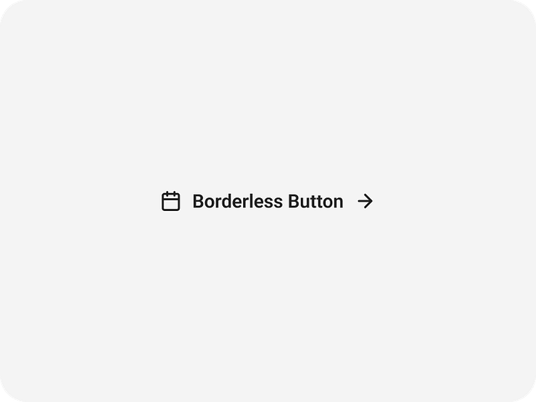
Borderless Button
Description: A minimalist, borderless variant used in contexts where visual disruption must be
Usage: Use it for less prioritized actions, such as links or settings.
Features:
Text-only or with an icon.
Visual feedback on hover.
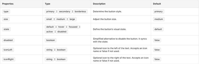
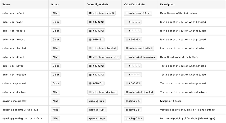
Properties and Design Tokens
General Props
Design token
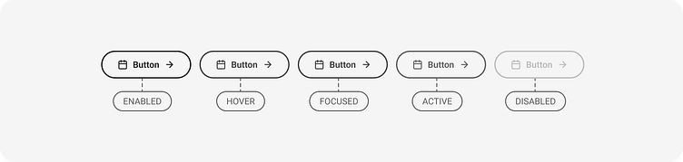
Primary button

Default: The initial state of the button when there is no interaction.
Hover: Changes visually when the cursor hovers over the button (only on pointer devices).
Active: Displays while the button is being pressed.
Disabled: Indicates that the button is not available for interaction.

Secondary Button
Default: The initial state of the button when there is no interaction.
Hover: Changes visually when the cursor hovers over the button (only on pointer devices).
Active: Displays while the button is being pressed.
Disabled: Indicates that the button is not available for interaction.

Tertiary Button

Default: The initial state of the button when there is no interaction.
Hover: Changes visually when the cursor hovers over the button (only on pointer devices).
Active: Displays while the button is being pressed.
Disabled: Indicates that the button is not available for interaction.
Layout and spacing
Large Button

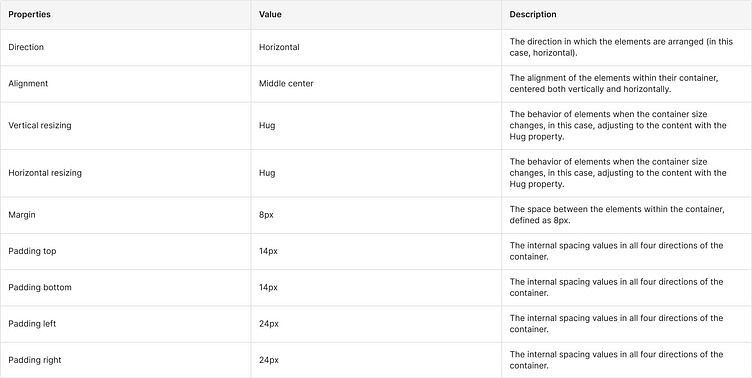
Medium Button


Small Button


Accessibility Guidelines
Minimum text contrast: The minimum text contrast was tested using the contrast plugin, which must be 4.5:1 to ensure readability.
Minimum click size: The minimum click size must be 44x44 pixels, according to WCAG accessibility guidelines, to ensure that buttons are easy to interact with for all users.
Interaction & style
Similarly styled components shouldn’t be used together if they don’t each pass the 3:1 contrast ratio. Higher contrast helps differentiate between a group of similar components.
Higher contrast helps differentiate elements
Don't use buttons together if they don't each pass the 3:1 contrast ratio

It's fine to use a single button that does not pass the 3:1 contrast ration since it's not in a group
✅ Do's
These are the recommended practices for using the Button component:
Use the Primary button for the main action on the page or flow.
Example: "Submit Form," "Buy Now."

Keep text short and clear.
Example: Use "Save," not "Click here to save your data."

Ensure icons have a clear purpose.
Example: A "right arrow" icon indicates a step forward.

Use disabled buttons for actions that are temporarily unavailable.

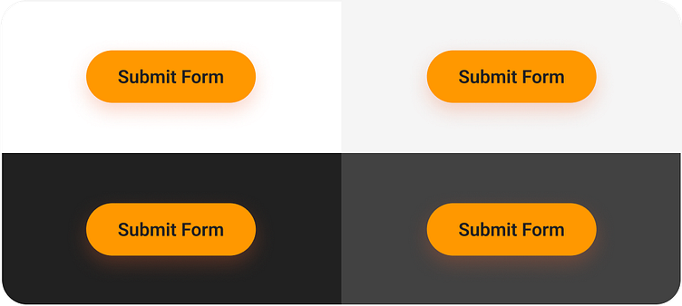
Maintain sufficient contrast between the button and the background.
❌ Don'ts
Avoid these common mistakes when using the Button component:
Do not use multiple Primary buttons on the same view. This creates confusion about which is the main action.

Do not use long text.
Example: Avoid "Click here to complete the registration process right now."

Do not use contradictory colored buttons that break the brand identity or confuse the user.